Butler Family Dentistry
Logo Redesign Project
Logo Redesign Project
***All visuals, concepts, and ideas were creative directed and/or executed by GARDNERstudio***
THE GOAL:
Butler Family Dentistry is a local dentist's office from my hometown in southern Indiana. I was at an appointment one day and happened to realize how outdated the logo was. This establishment is one that is highly respectable and their branding should represent them in the same way.
Butler Family Dentistry is a local dentist's office from my hometown in southern Indiana. I was at an appointment one day and happened to realize how outdated the logo was. This establishment is one that is highly respectable and their branding should represent them in the same way.
After leaving the appointment I set out to create a logo similar to their old one (so their clients wouldn't be too off put).
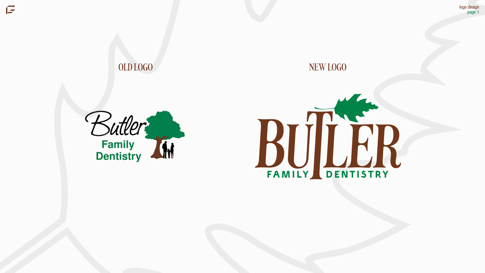
OLD AND NEW LOGO COMPARISON:
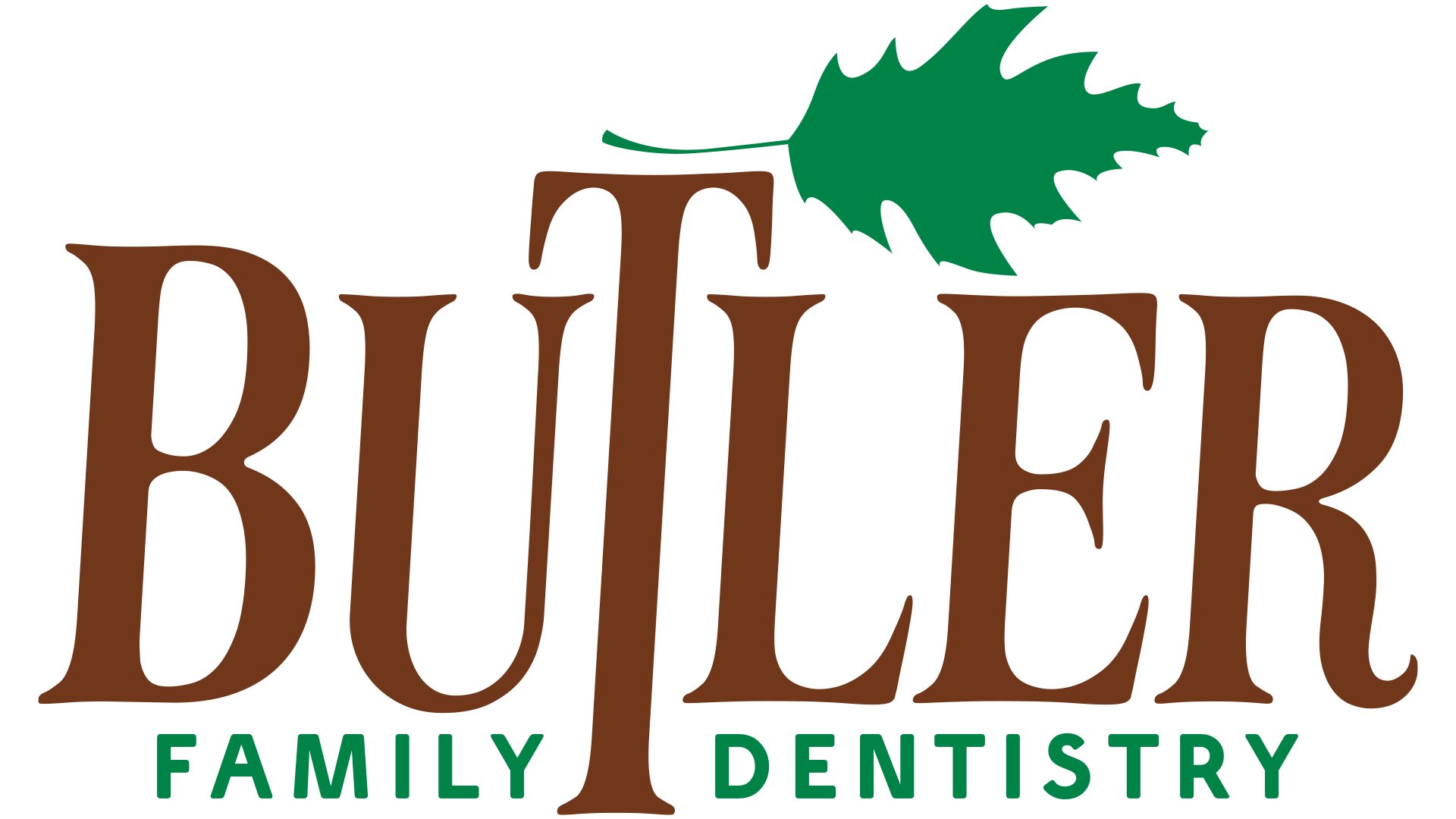
The style of the old logo seemed a bit too playful to me for a dentist office. They do have children that go there as well, so I kept that in mind when creating the new logo. I made sure that the energy of the logo was just as "inviting" as the previous one.
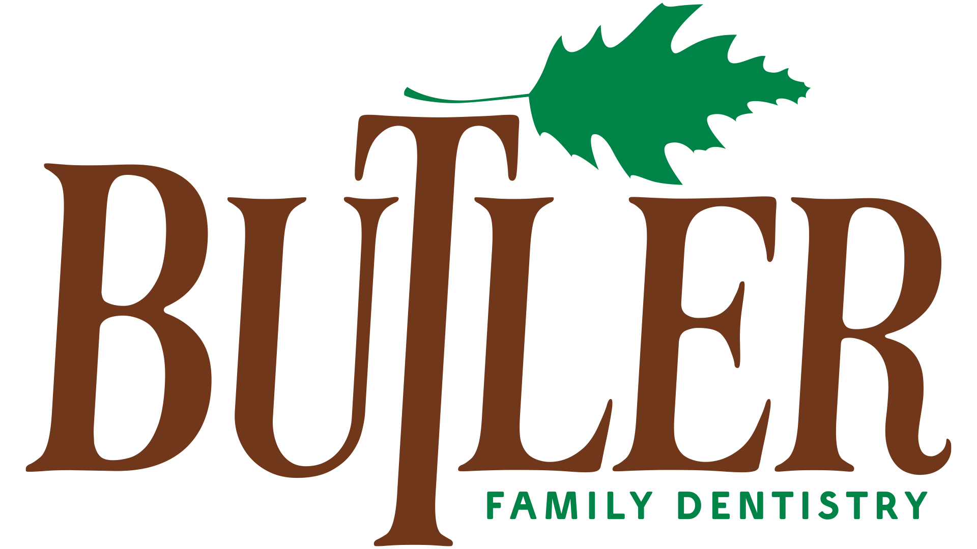
In the new logo concept, I kept the exact same colors so that it would be no confusion when driving by. The font change was something I deemed necessary for the main "Butler" text, but I kept a similar font as the "Family Dentistry" and made it all caps. I elongated the "T" in "Butler" to resemble a tree, and added a single oak leaf that will evolve into the brand pattern and other elements of the brands identity.
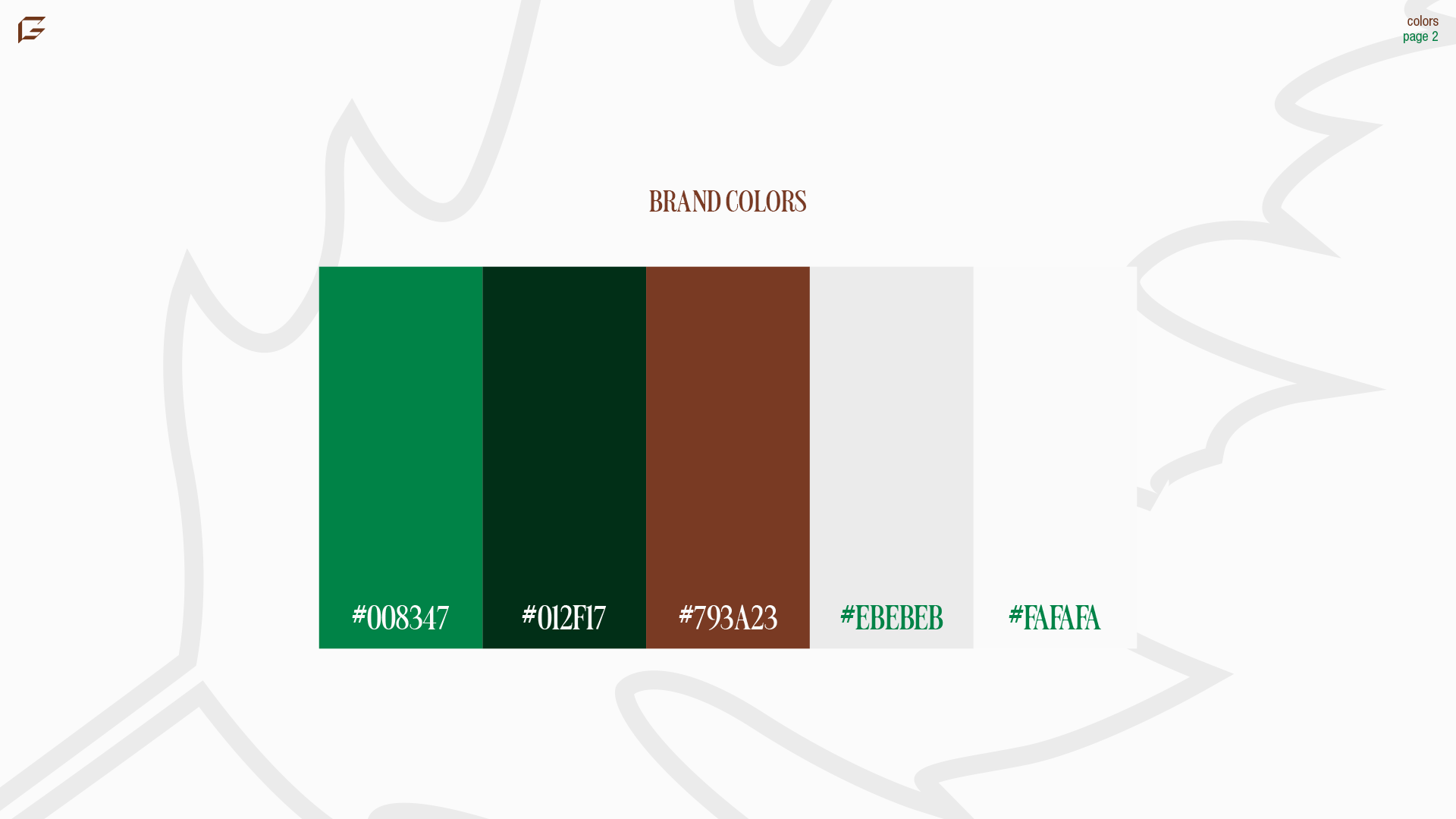
COLOR PALETTE:
I kept a portion of the color palette the same from the old branding, but added three new colors. The first green and the brown are the colors from the previous logo, but the darker green, light gray, and off-white are new additions. This palette offers perfect combinations for light, dark, and everything in between.
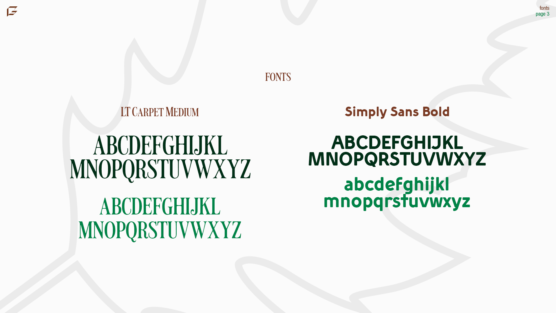
FONT CHOICES:
LT Carpet Medium and Simply Sans Bold are the two fonts used for this branding. LT Carpet is a classy serif font that feels elegant and high-class. This is the perfect font to represent the work that they do over at Butler Family Dentistry.
Simply Sans is a good supporting sans serif font to be used in paragraph/body text, as well as the "Family Dentistry" portion of the logo.
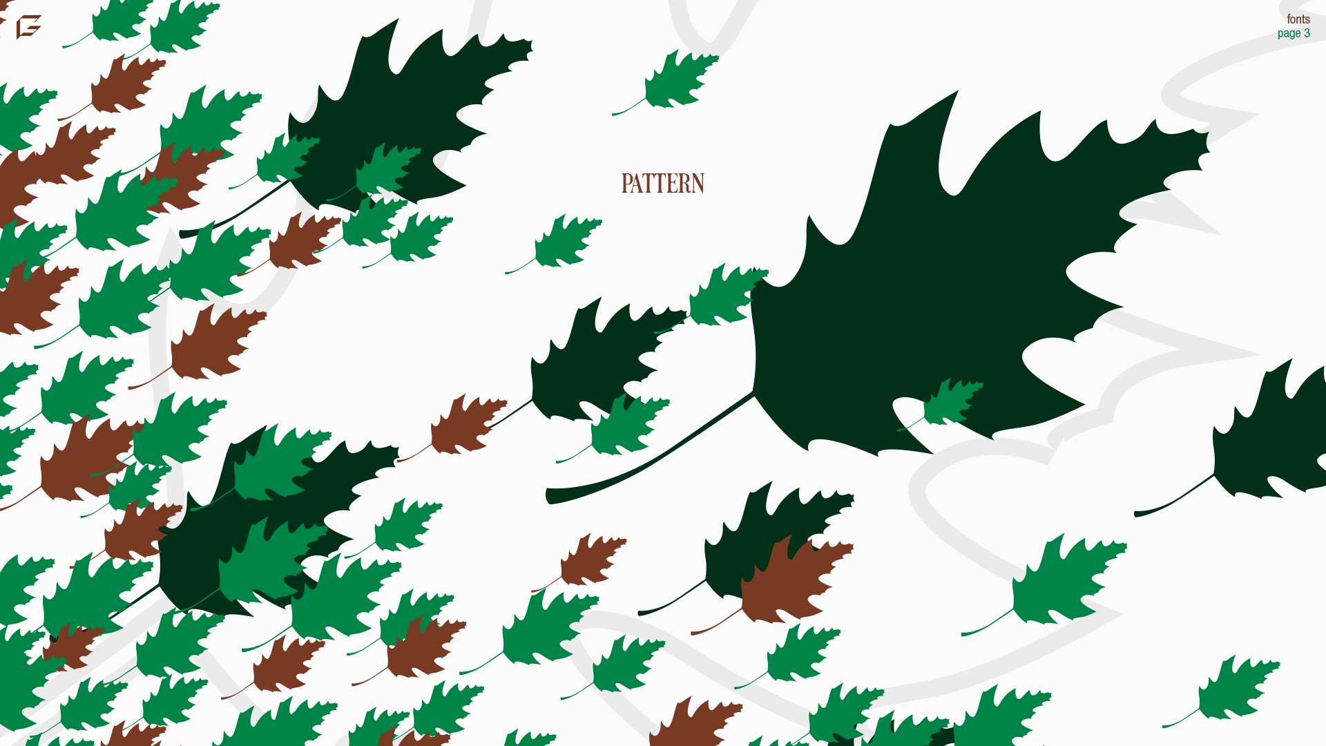
BRAND PATTERN:
The oak leaf in the logo is highly versatile brand element that can be used for a plethora of things. This pattern could be painted along an interior wall, on mailers, or even on reminder emails for upcoming appointments.
In the background is an outline of the leaf also, that could also be considered a part of the brand pattern capabilities.
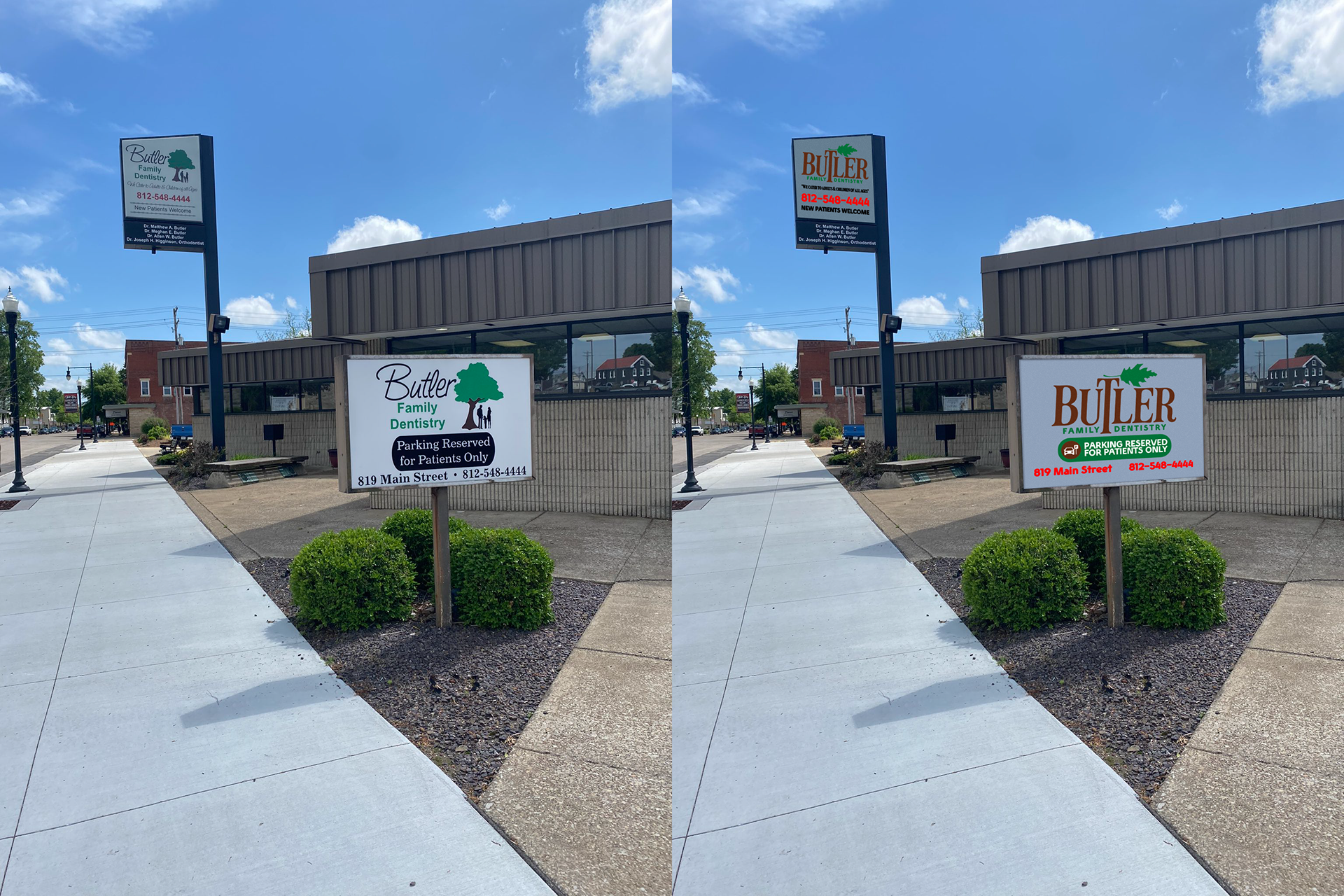
LOGO SINAGE REPLACEMENT:
Above you can see the before and after of the sign out front of the office. The left side is their current sign. It's not a bad sign, but it could surely use some improvements, including the logo.
In the new version, the office looks much more mature and professional.
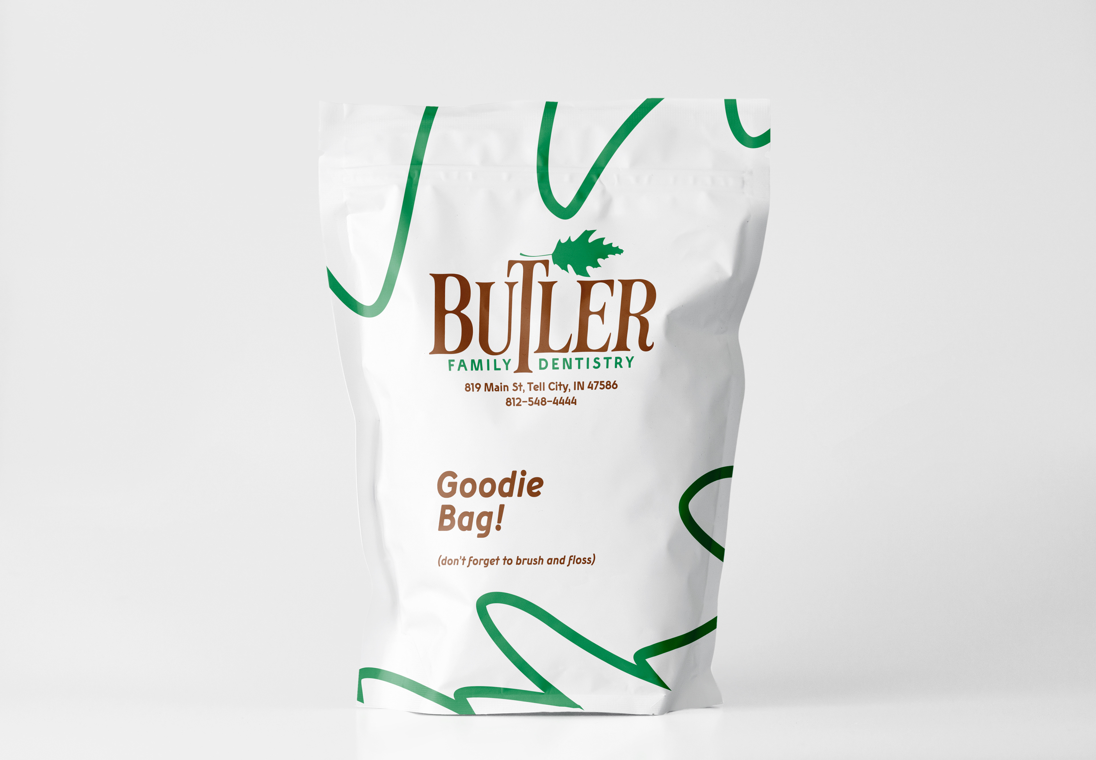
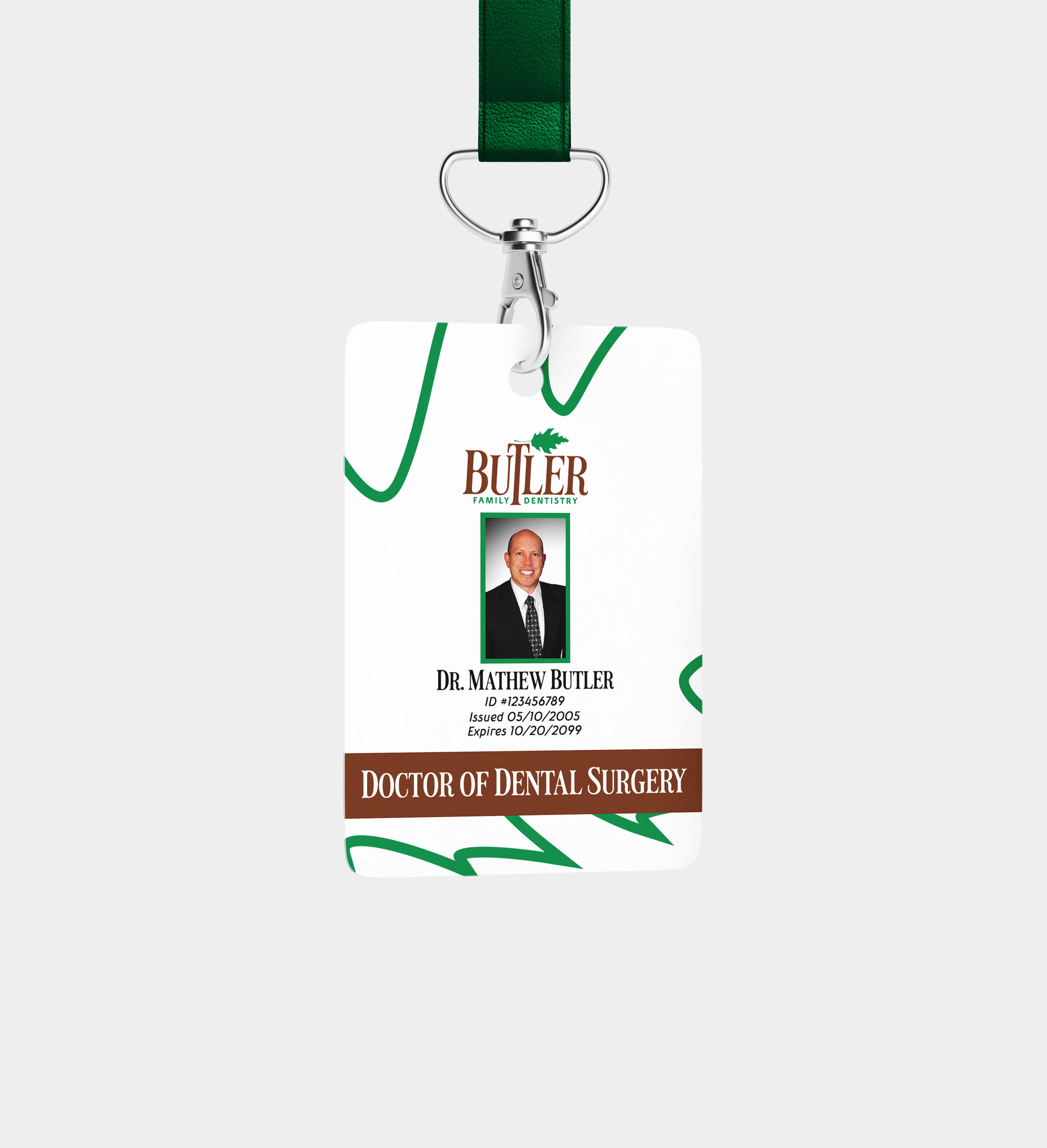
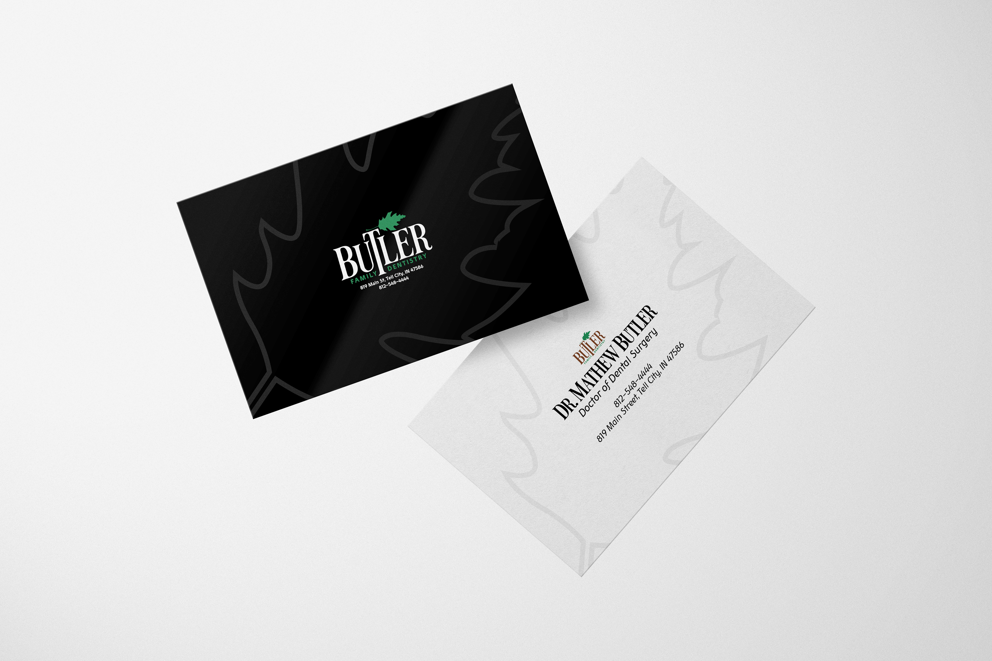
APPLICATIONS:
The use of brand elements to create an experience for a patient creates a sense of trustworthiness. Whether it's a business card, a badge, or a goodie bag, a patient going to the dentist appreciates these aspects of their visit.

“No one can take our smiles away when dental decay is kept miles away.”
-Prof. Dr. Ninad Moon
-Prof. Dr. Ninad Moon