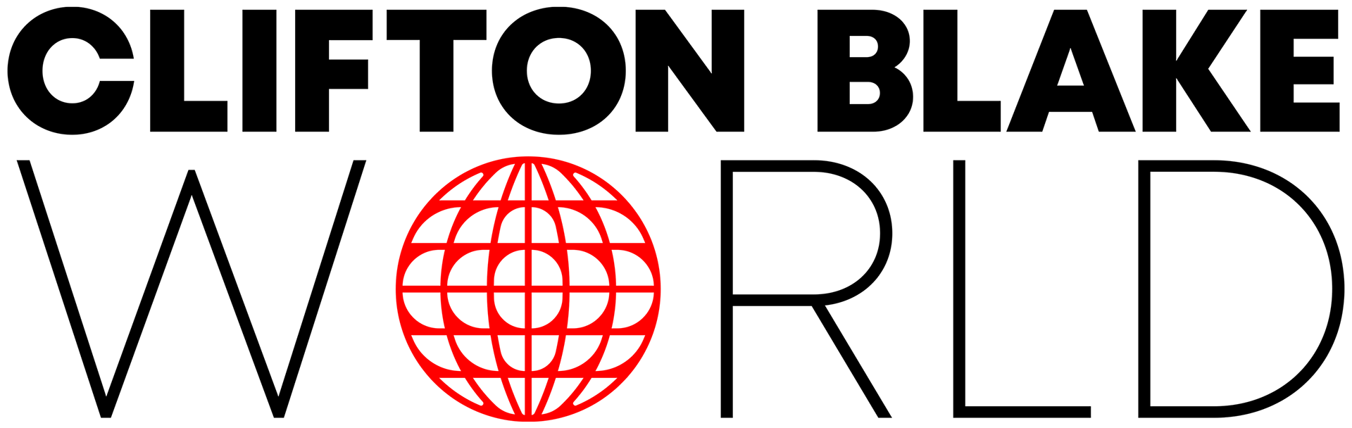
Clifton Blake World
Logo Design Project
Logo Design Project
***All visuals, concepts, and ideas were creative directed and/or executed by GARDNERstudio***
THE GOAL:
Clifton Blake is an Atlanta based photographer who was a friend of a friend at the time of him reaching out. He was referred to me by a mutual and was in great need of a logo. He, like the Hello Koffee brand, didn't have a logo so I was offered creative freedom in creating this logo.
Clifton Blake is an Atlanta based photographer who was a friend of a friend at the time of him reaching out. He was referred to me by a mutual and was in great need of a logo. He, like the Hello Koffee brand, didn't have a logo so I was offered creative freedom in creating this logo.
I went into this project with the mentality that I was making a logo for another creative, and I had big shoes to fill because creatives are typically very particular in their branding.
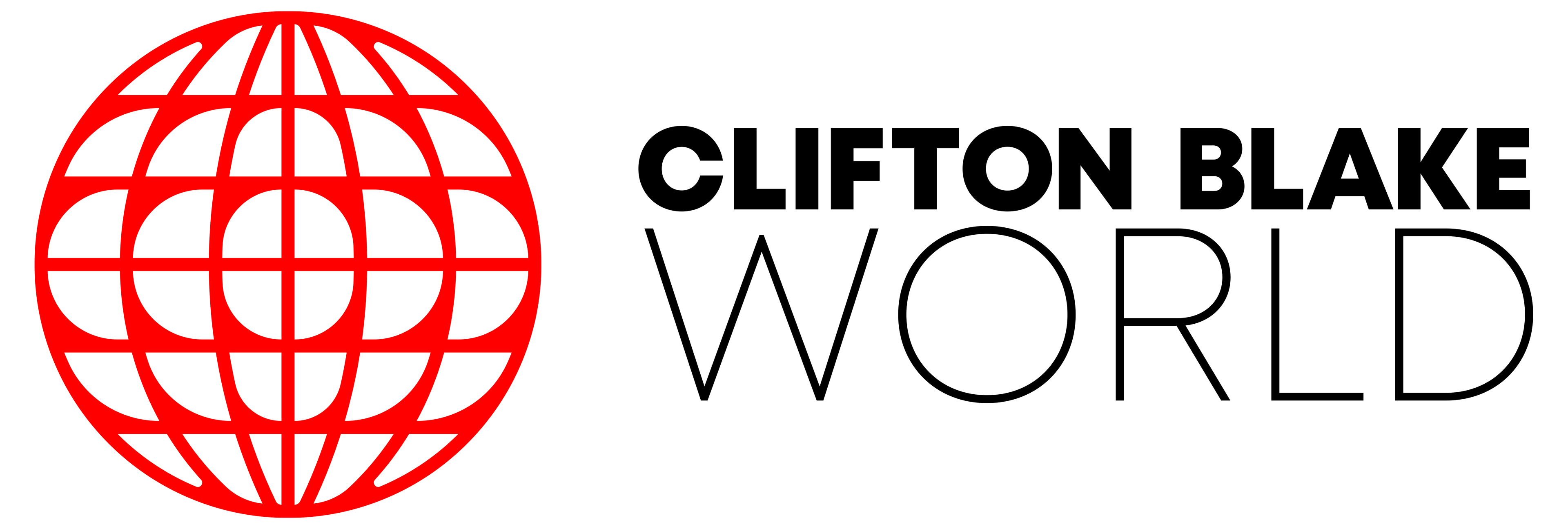
NEW LOGO:
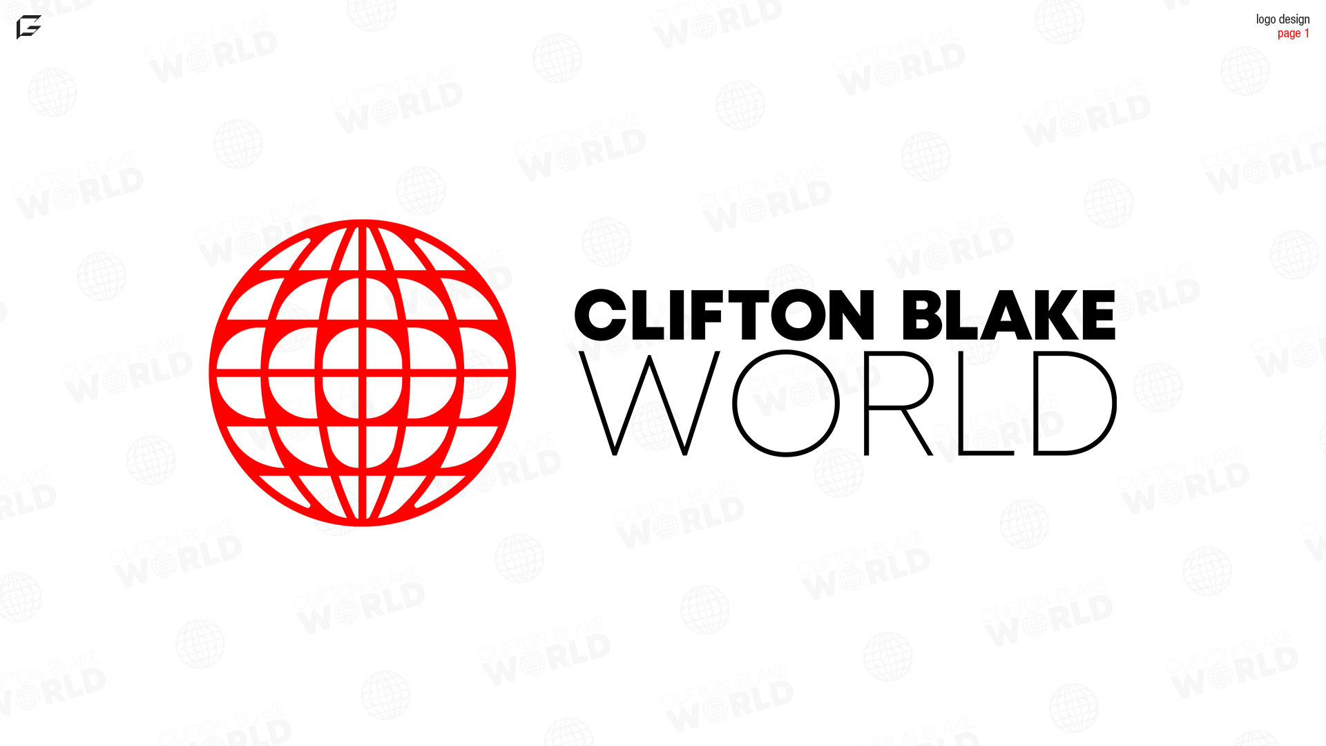
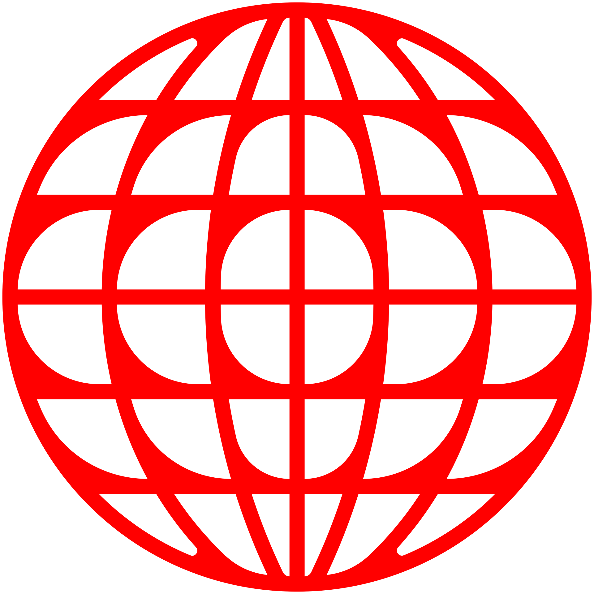
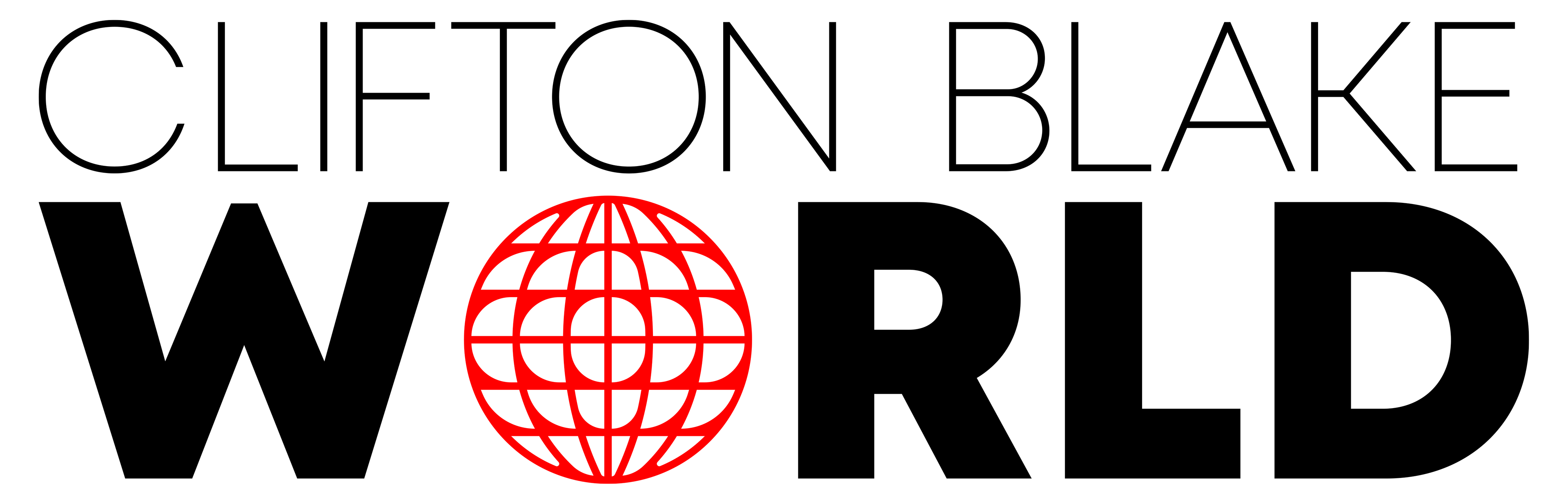
Clifton noted that he wanted something clean and minimal. Since his name is Clifton Blake "World" he was also insistent that he get a standalone icon in a globe style. After a few revisions, we landed on the iconic Clifton Blake World globe.
Both me and Clifton loved the way this logo turned out, and he feels it represents him perfectly.
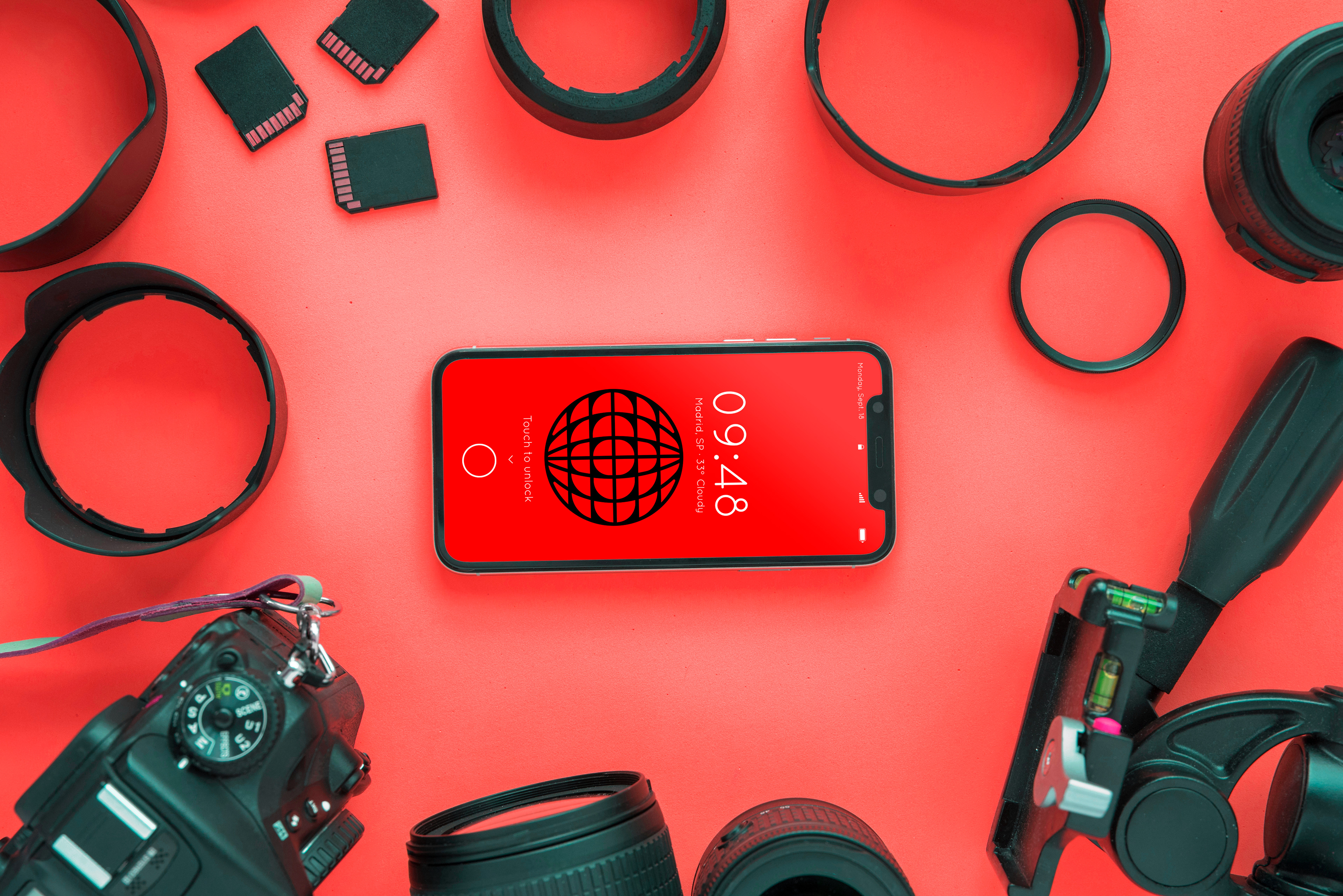
COLOR PALETTE:
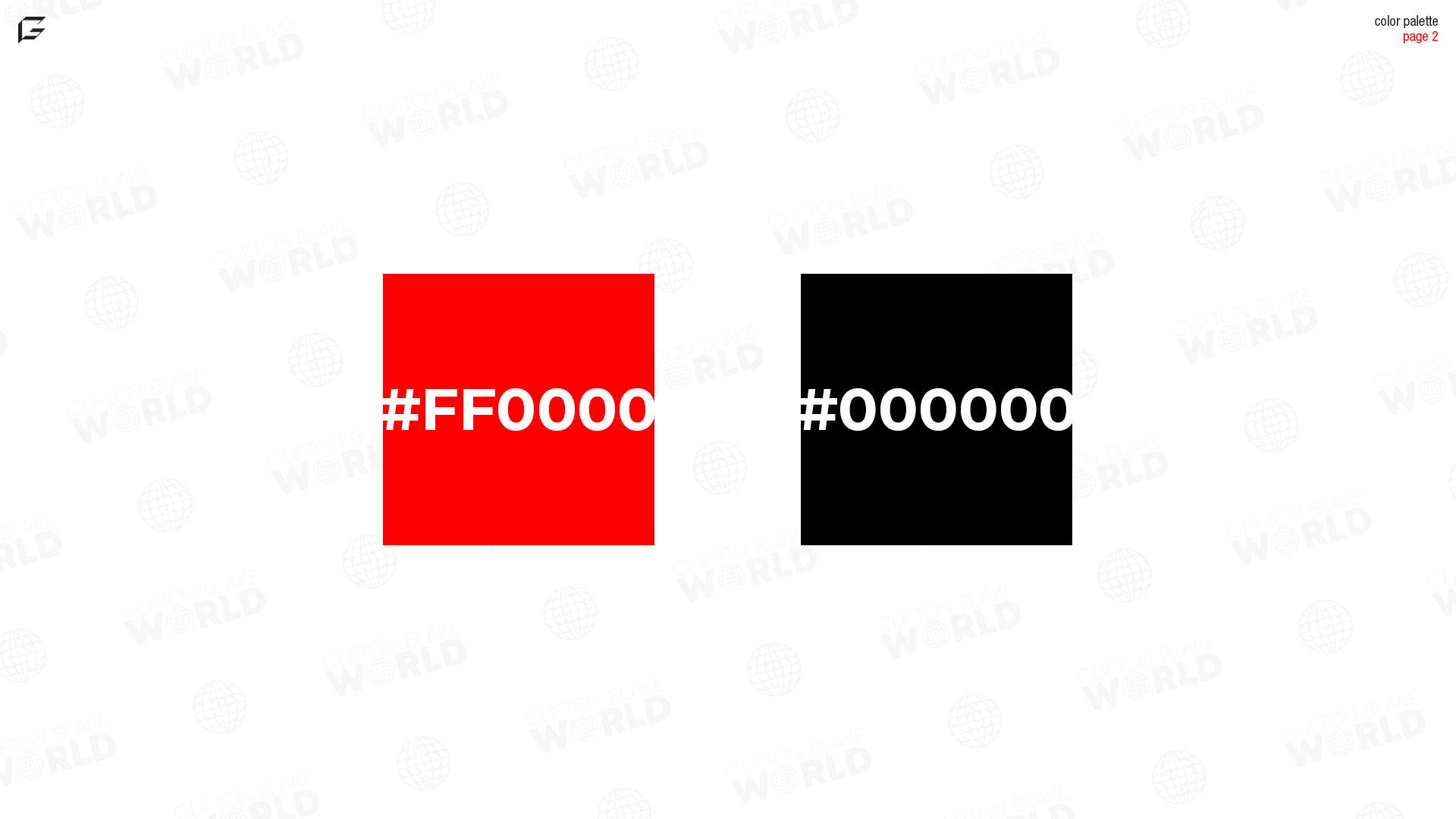
The colors of a brand are important depending on industry, design of the logo, and the brand's aesthetic. Every aspect of a brand could be perfect, but seem off due to the color choice of the designer. In this case, jet black and absolute red were chosen between myself and Clifton.
This palette was meant to be bold and undeniable.
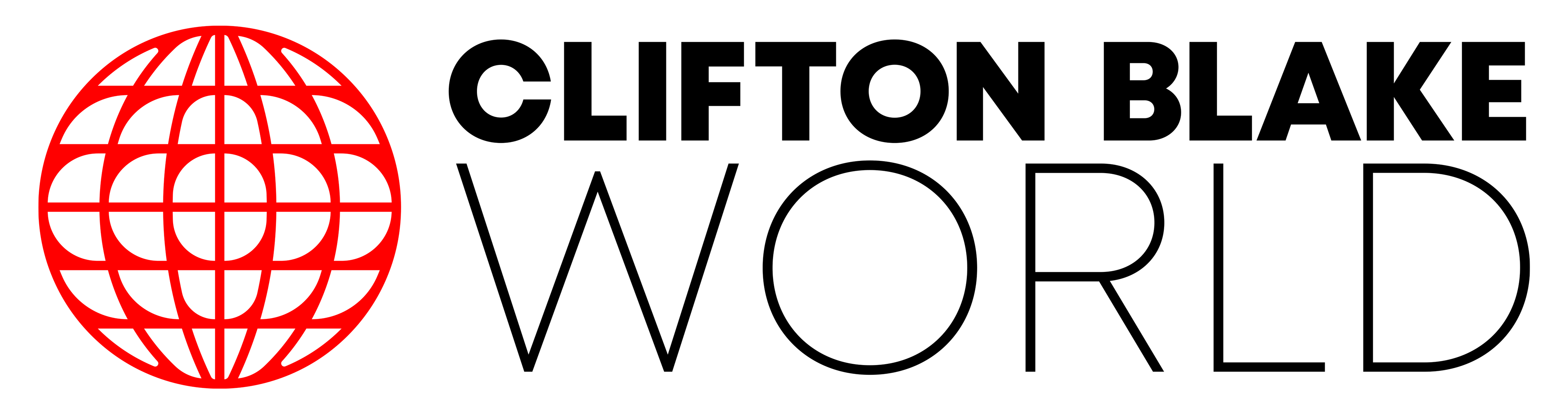
FONT CHOICES:
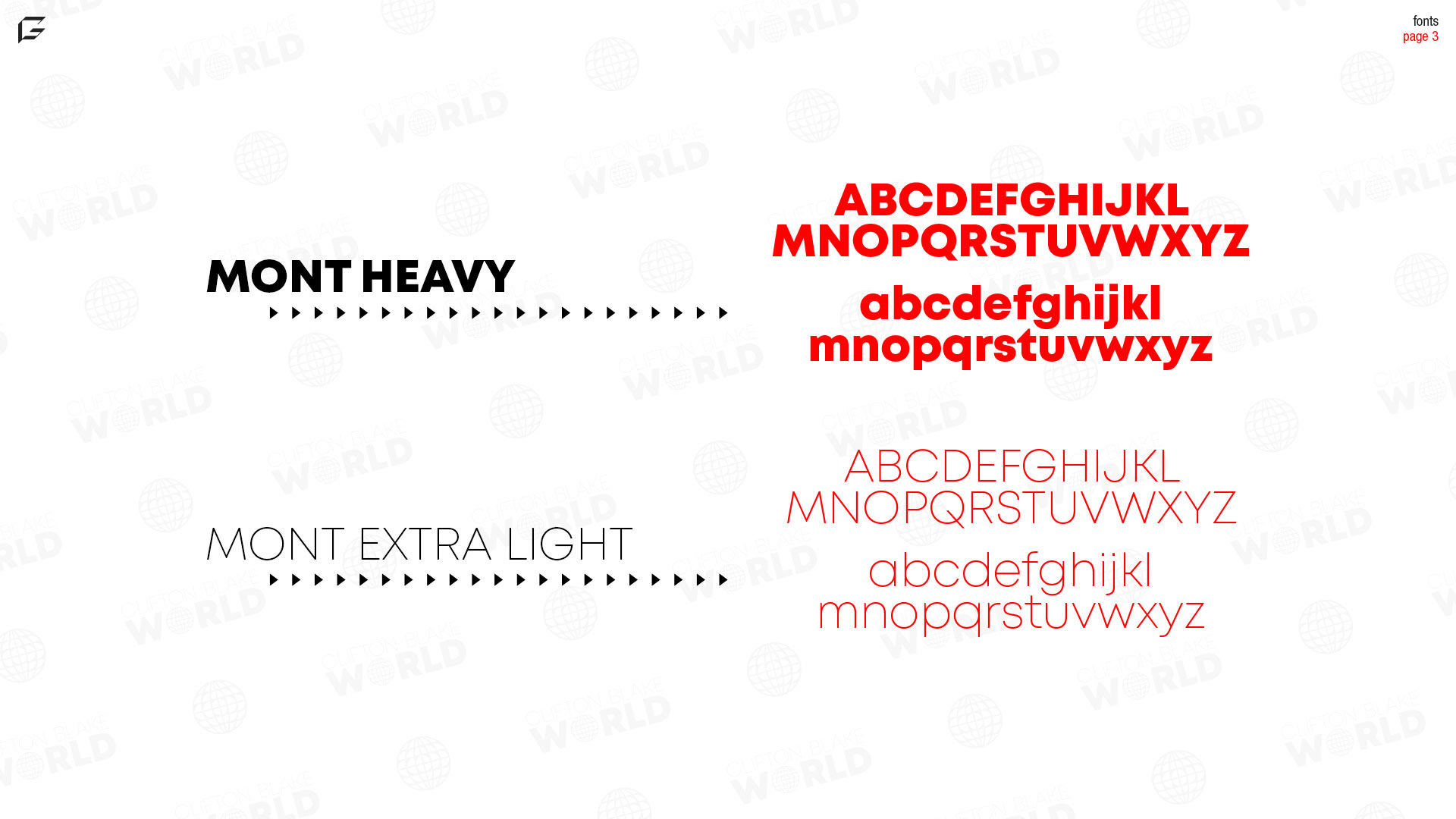
The font I decided on was a modern sans serif font that compliments the logo's simplicity. The Mont extra light font was chosen to work well with the logo in the text-based format of the whole "Clifton Blake World" wording. When replacing the "O" in "World" with the globe icon, the extra light version of Mont allows the icon to fit in naturally.
Mont heavy was the version of the font was decided on initially. The boldness and unmistakable legibility was crucial in deciding on the font that would go with the logo and with Clifton's brand.
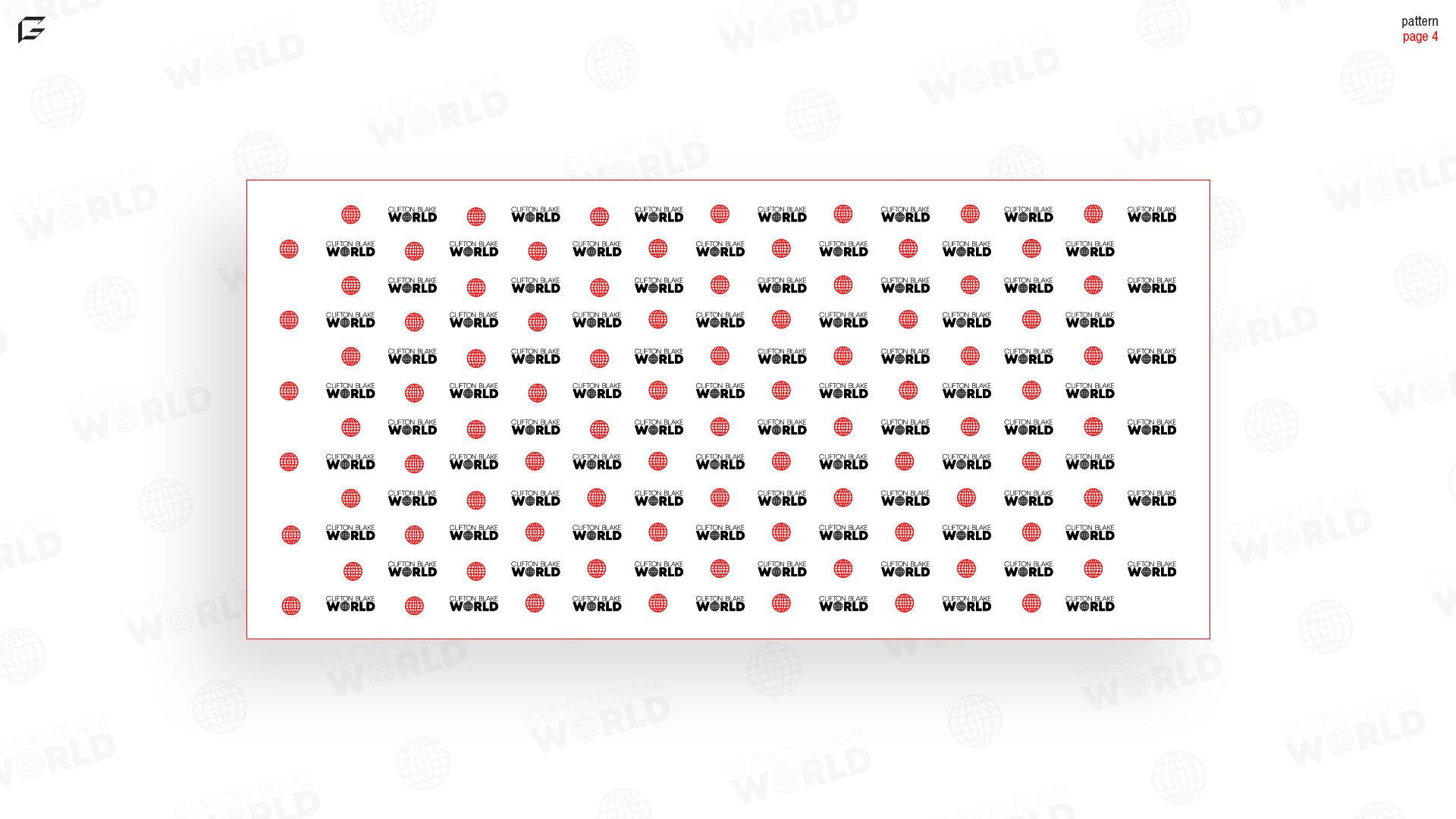
BRAND PATTERN:
The use of patterns for branding is something that can make logos, logo elements, and multiple logo variations come together in a seamless way. In creating this pattern, my goal was to make something similar to step and repeat photography backdrops you see on red carpets.
Clifton Blake also offers physical products on his website, and packing paper with this arrangement could be used to add to customer experience.
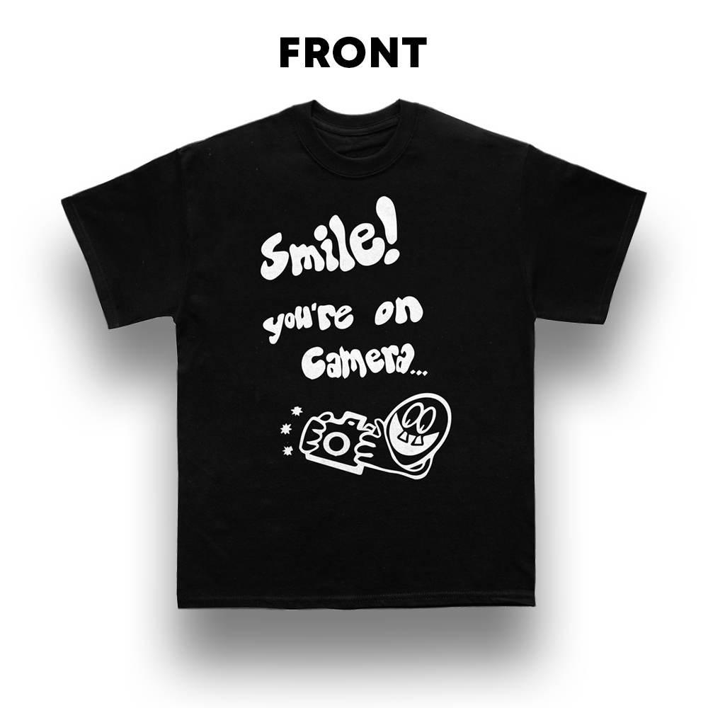
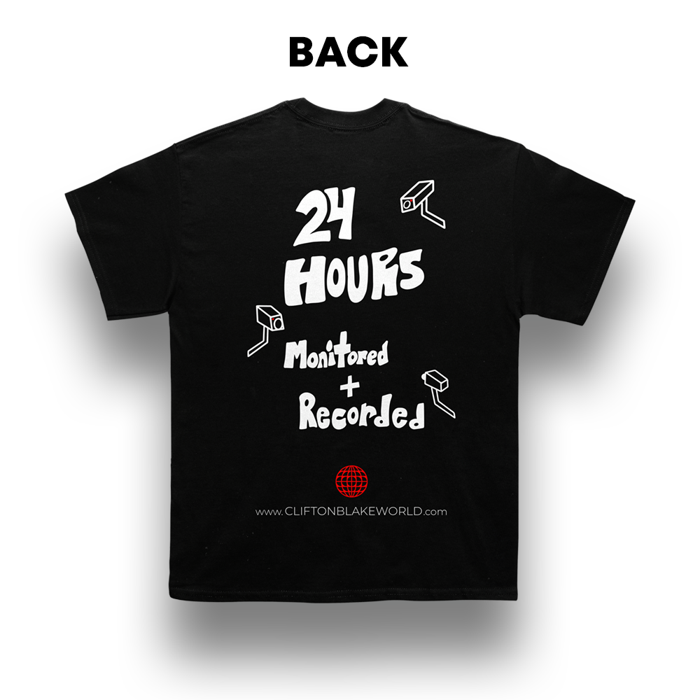
CLIFTON'S SHIRT:
When Clifton is on set, he usually wears this shirt that him and I collaborated on. On the back you can see his logo and how it can be used on apparel.
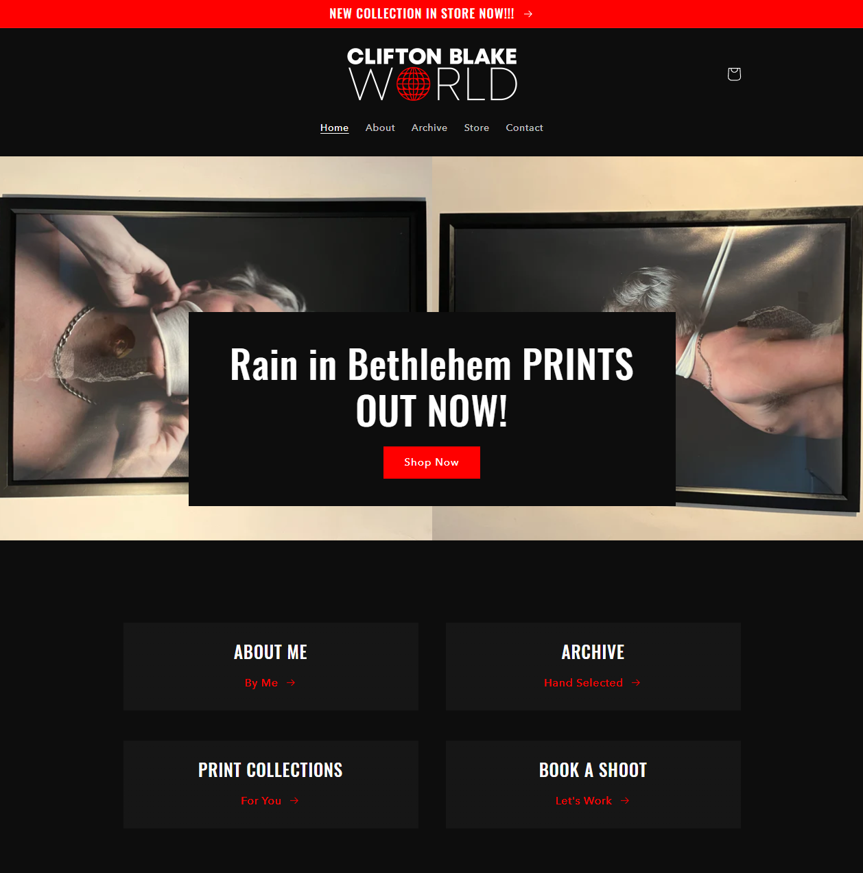
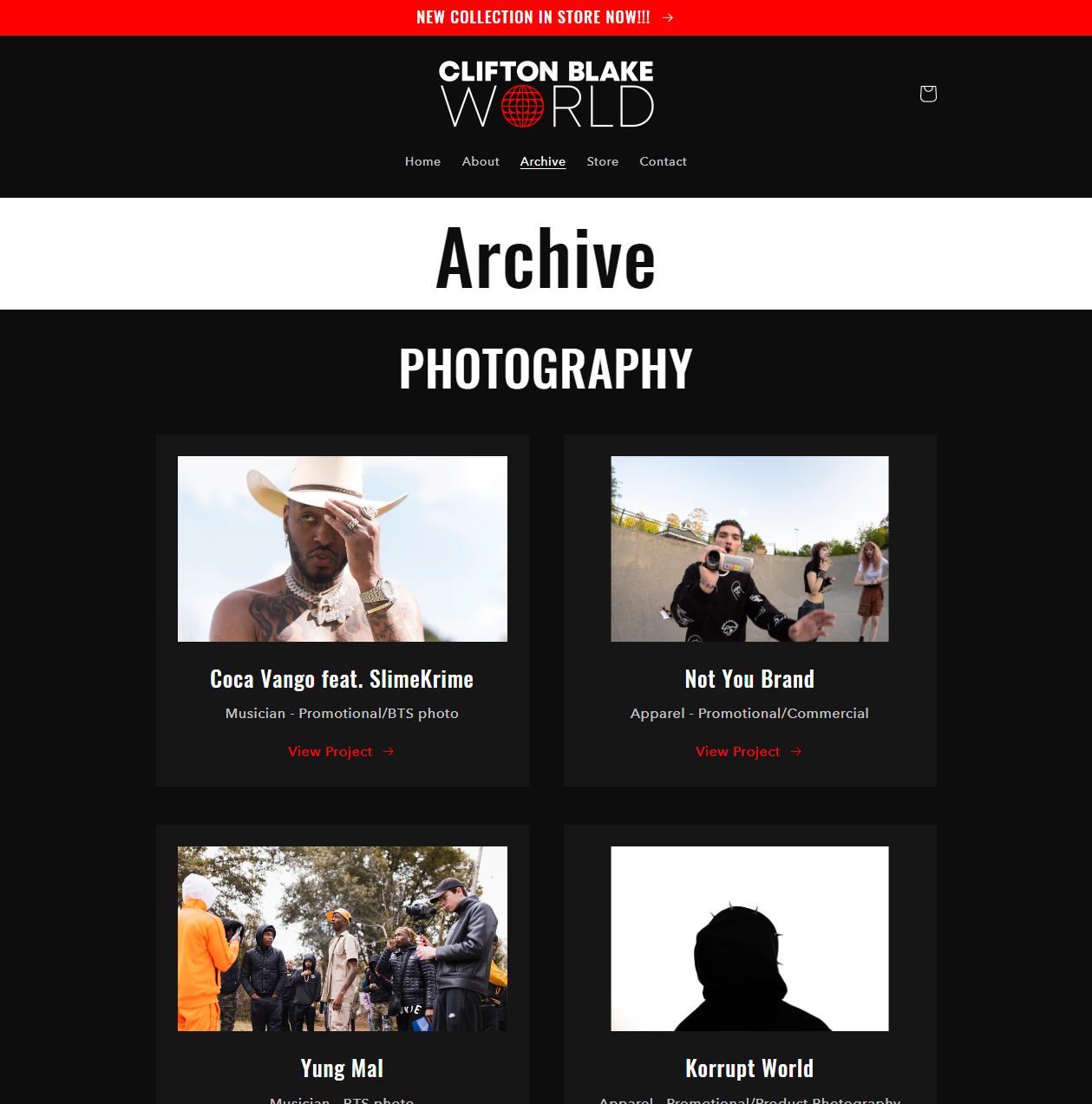
WEBSITE:
I was also commissioned separately to create Clifton Blake's official website. The layout was the most important part, as this deal was simply to get his website started and not to be the manager of the website in the long term.

““The best thing about a picture is that it never changes, even when the people in it do.”
-Andy Warhol
-Andy Warhol