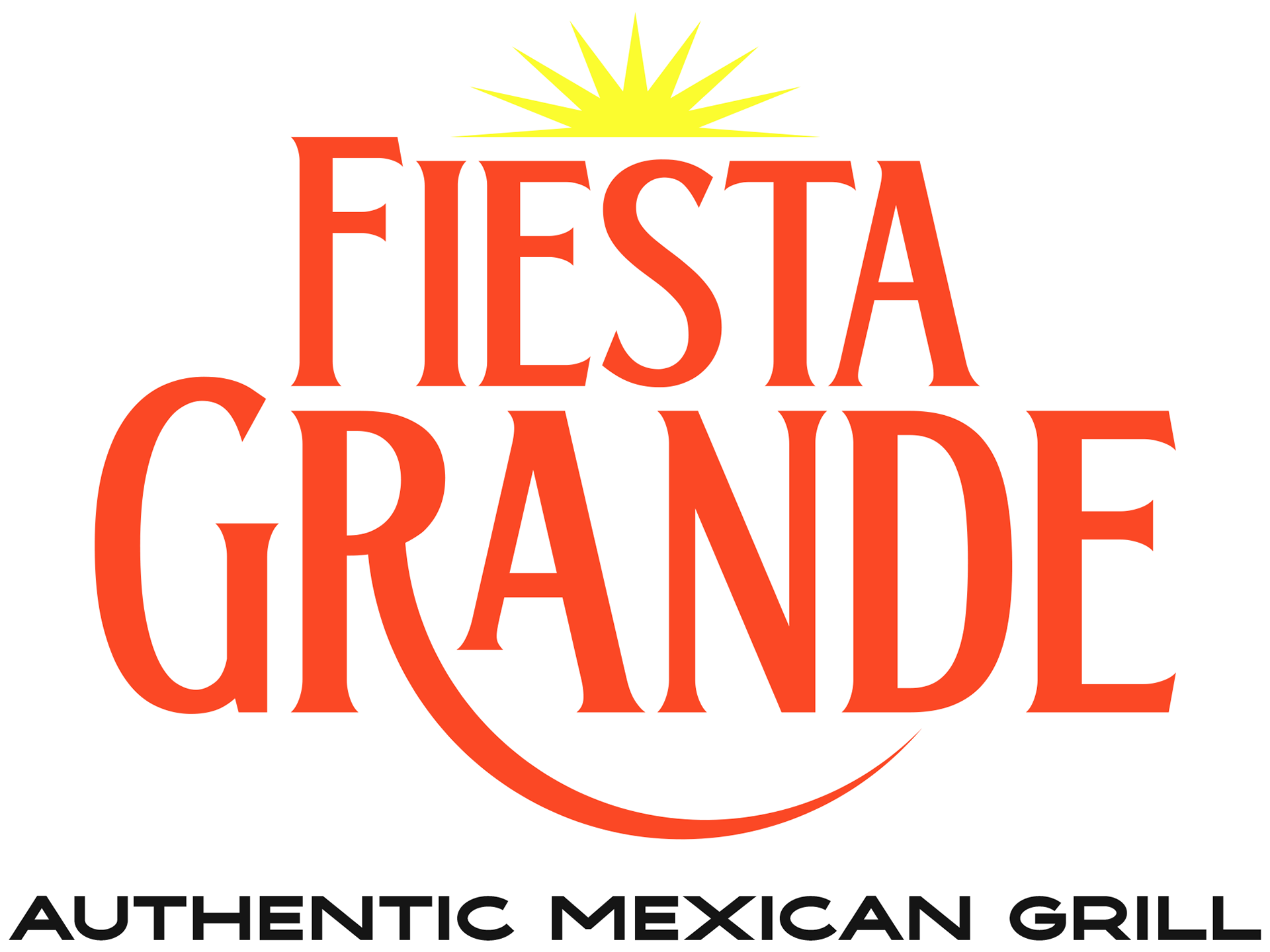
Fiesta Grande and La Fiesta
Logo Redesign Project
Logo Redesign Project
***All visuals, concepts, and ideas were creative directed and/or executed by GARDNERstudio***
THE GOAL:
Fiesta Grande is a local restaurant that serves the best Mexican cuisine in town. Their current branding is a bit outdated and needs to be brought to the modern era to match the quality of food they deliver on a daily basis.
Fiesta Grande is a local restaurant that serves the best Mexican cuisine in town. Their current branding is a bit outdated and needs to be brought to the modern era to match the quality of food they deliver on a daily basis.
They've also expanded to a location in Kentucky that has similar branding and needs to be brought up to date.
OLD AND NEW LOGO COMPARISON:
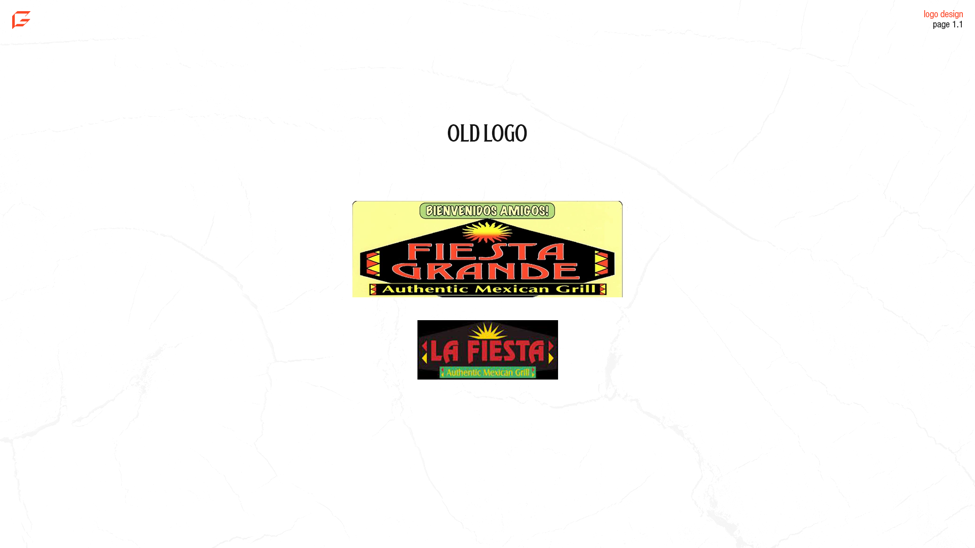
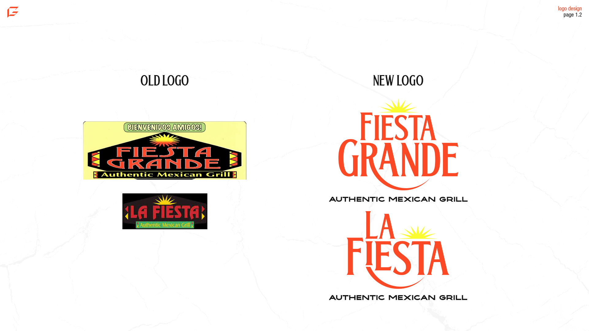
The first page of this presentation shows the difference between the old logos and the ones I created. The old Fiesta Grande logo is very stretched, as well as the fonts of the main text and the tagline aren't complementary. It's also something to note that these restaurants are essentially the same and are run by the same people, yet the logos don't look similar.
My editions of the logos bring both Fiestas into the current era with a nice serif typeface. The complementary font is a wide, bold, sans serif font which fits perfectly with the logotype. The sun seemed to be an important aspect of the previous logo, and I felt it would fit perfectly with the new concept. In the "R" of "Grande" and under the "I" in "Fiesta", I've added the outline of a setting sun that represents the red part on the bottom of the original Fiesta Grande logo. I've kept the colors from the original Fiesta Grande logo to maintain brand consistency and not be too alarming for customers.
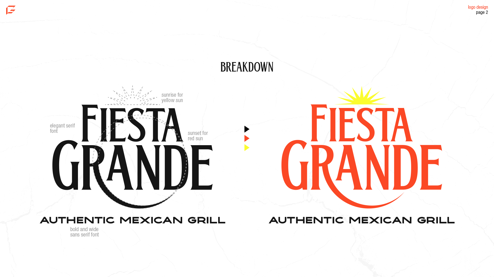
LOGO CREATION BREAKDOWN:
When approaching the actual creation of the logos, I was meticulous in trying to honor the current branding while making some needed updates and modernization. The font choices are a great mix of a tall serif font with thin stems and subtle serifs. This font is very different from the current font, seeing as the current one is more bold and wide. Wide fonts in certain logotypes can work, but the name typically needs to be pretty short. In this situation, the length of the words makes the logotype very long and difficult to work in vertical applications. Also, the complementary font is similar to the previous tagline font, but I've decided to make it all caps to add contrast and emphasis.
To make the mark stand out, I've also pulled from the previous icon by adding the sun. I've simplified the design of the sun, but it in half horizontally, and added it on top of the logotype. From there, I realized the logo needed something else to really separate it from the competition. As I was looking at the logo with the type and the sun on top, I noticed the "R" had a really nice leg and it gave me an idea. The original logo has a sun with a gradient, with the top being yellow and the bottom being red. I interpreted this as a setting sun, so I wanted to add that as the new leg because I knew the text was going to be red.
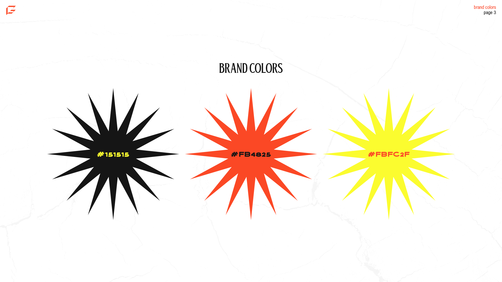
BRAND COLORS:
After the logo was done in black and white I had to add colors. I pulled the colors from the original logo because changing the logo and the colors can be overwhelming for customers. The main color is of course the iconic shade of red that I wanted to maintain as the center of attention in the logotype. The sun is the same yellow as the top of the sun in the old logo, but I modified the darker color to be just a bit lighter and more of a dark grey.
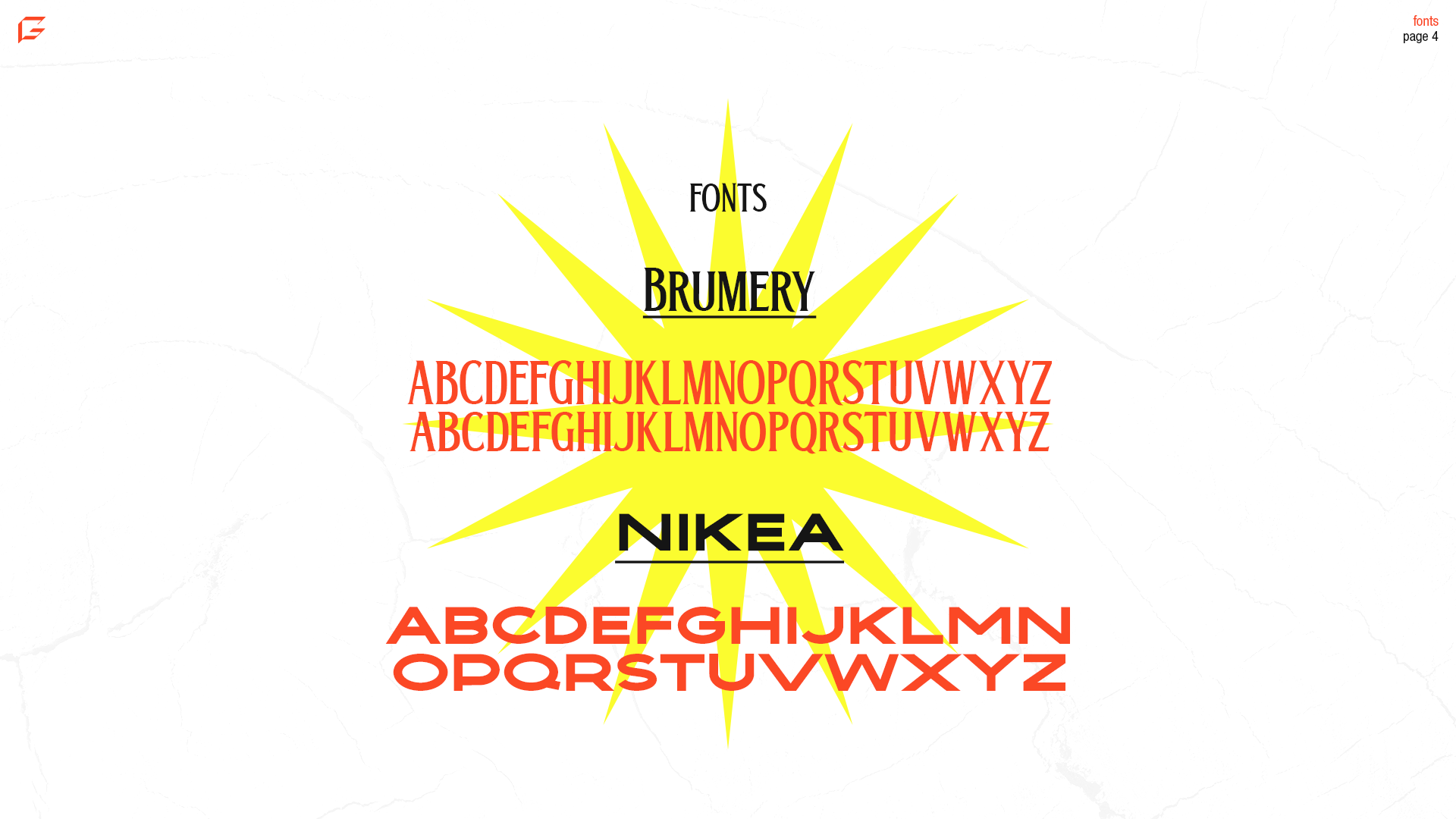
FONTS:
Choosing Brumery and Nikea for fonts seemed to me to be obvious choices when I found them. Brumery was a perfect font for the main text due to it's tall nature and high "x" height. When considering the word "Grande" I wanted something tall that would stand out and Brumery seems to do that seamlessly.
Nikea is an outstanding font for the tagline because of it's bold and wide profile. It's similar to the old saying, "opposites attract," simply because often times opposite font types complement each other well, along with opposites on the color wheel.
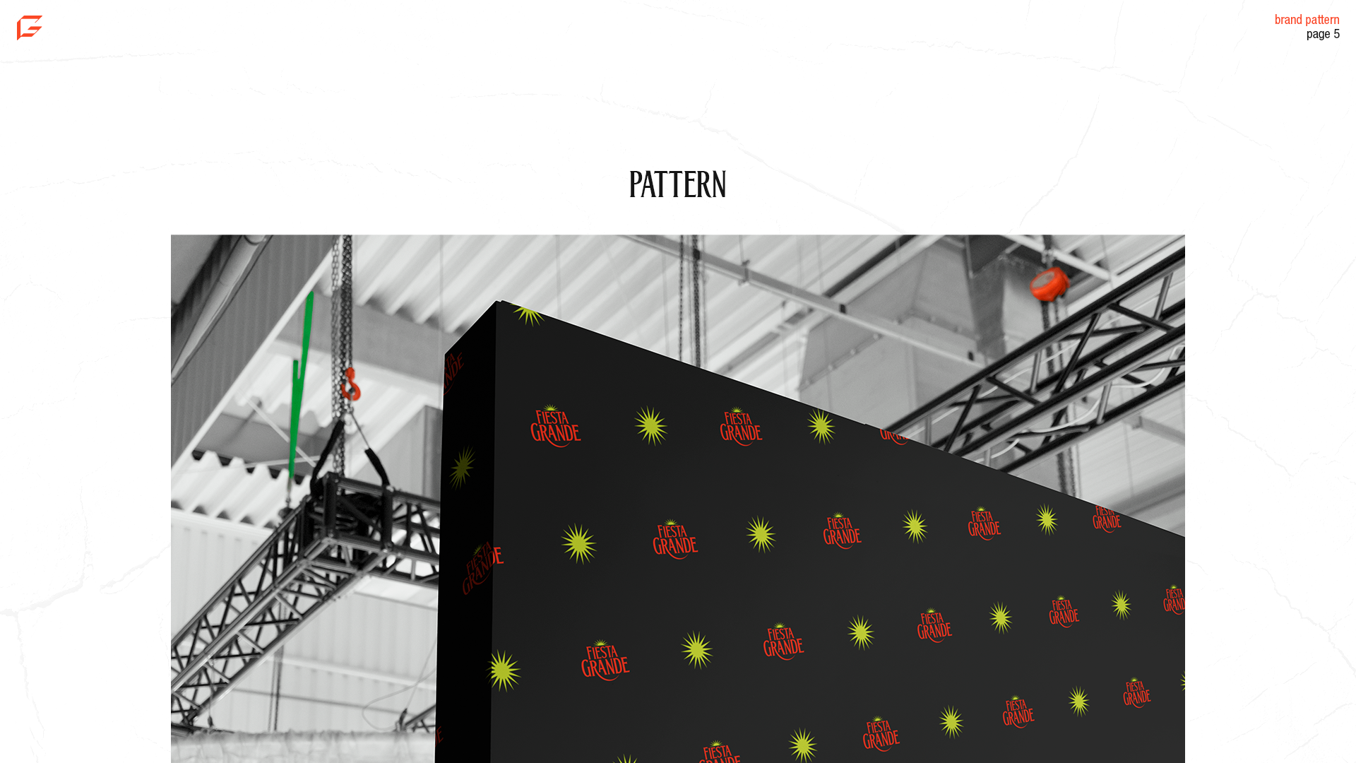
PATTERN:
It's typical to keep patterns simple in terms of branding, but nonetheless patterns are very effective. Of course this pattern otherwise would be shown in a different context, but this image highlights the use of a Fiesta Grande pattern and how it could be effective.
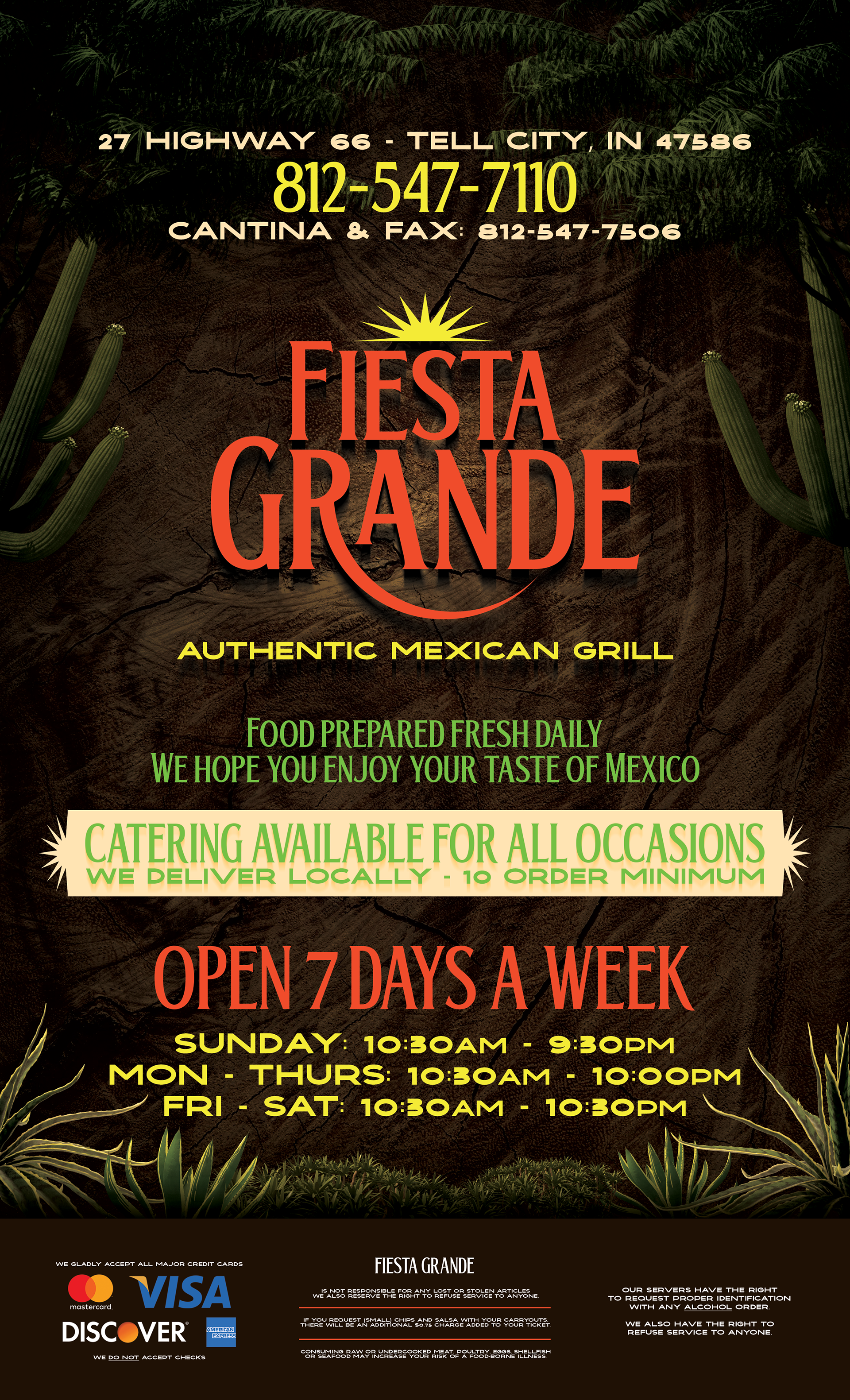
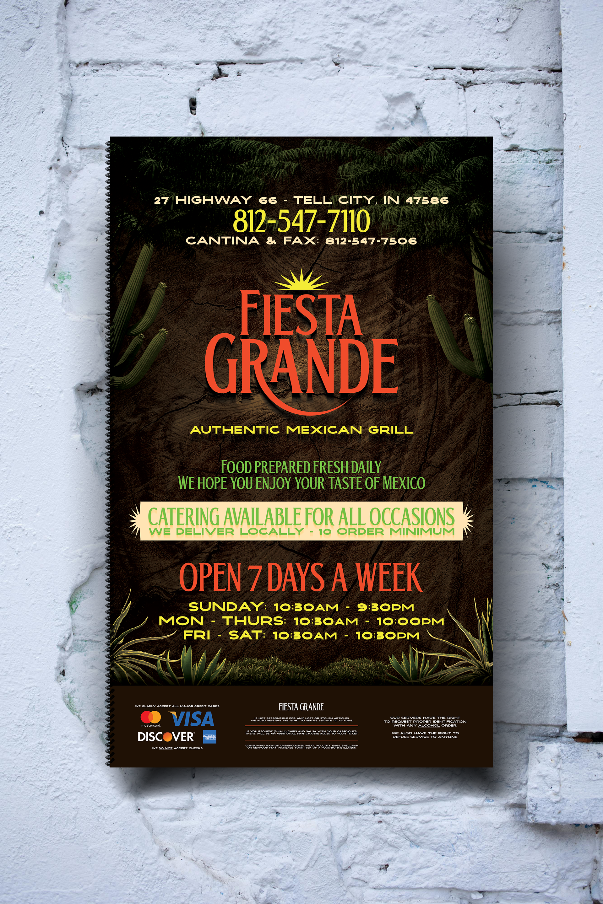
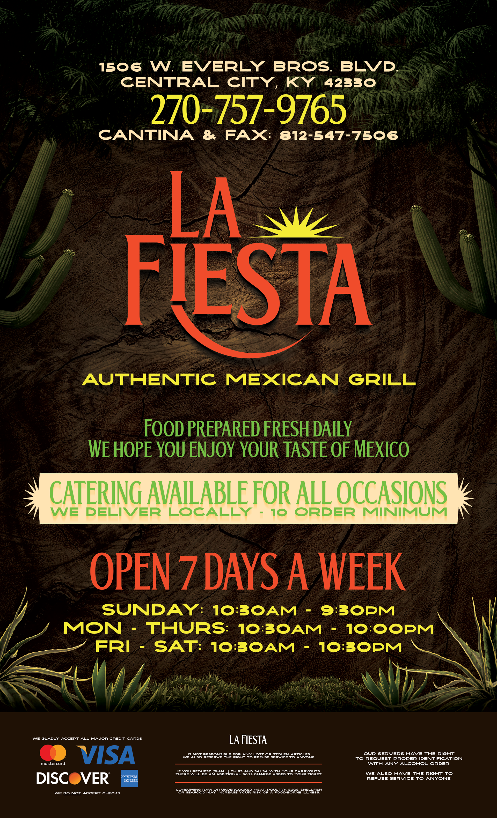
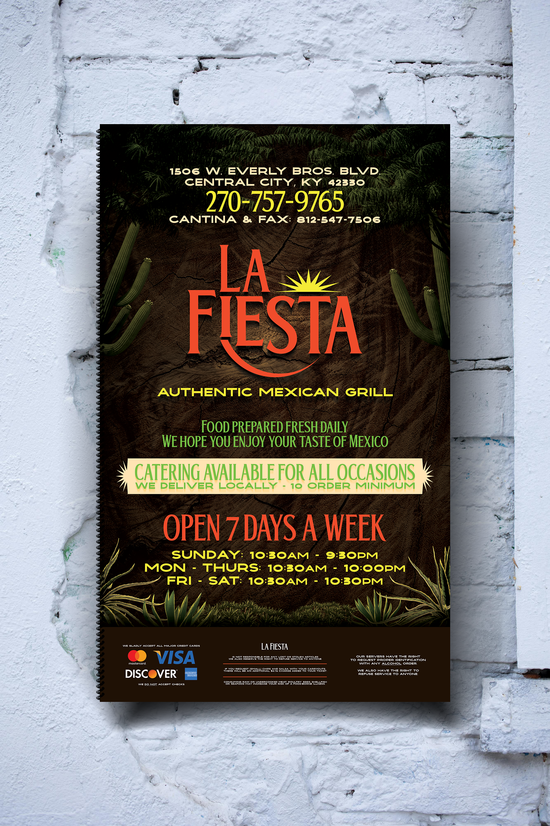
MENUS:
A restaurant's menu is arguably one of the most important tools they have to make sales. The menu should be beautiful, clear, and communicate effectively, and this menu cover I produced checks all those boxes. I made the same menu for each location with the exception of the logo, address, and phone number. This way the customers will know that they are the same franchise when going between locations.
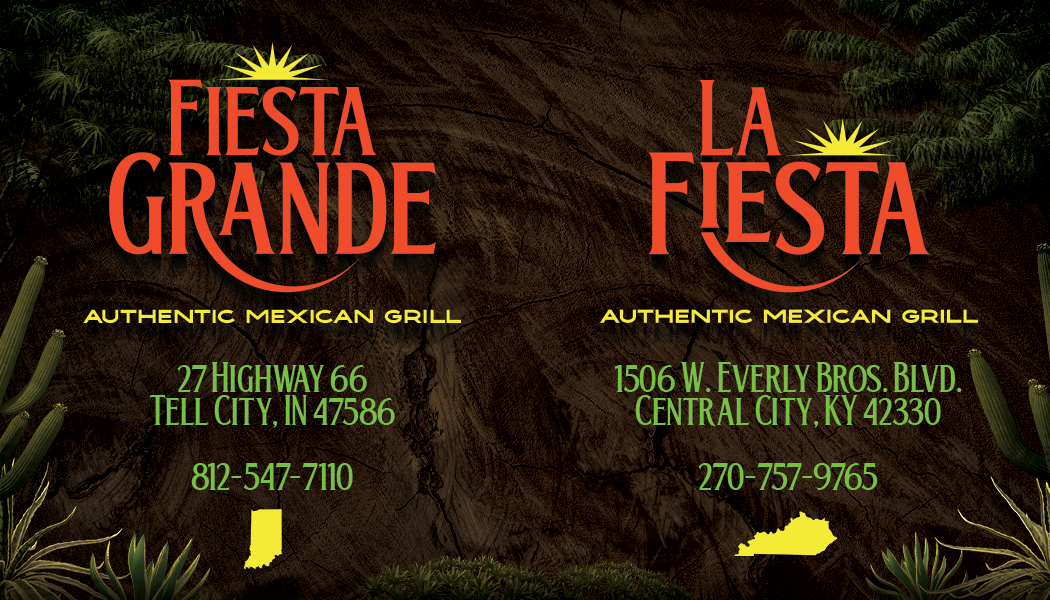
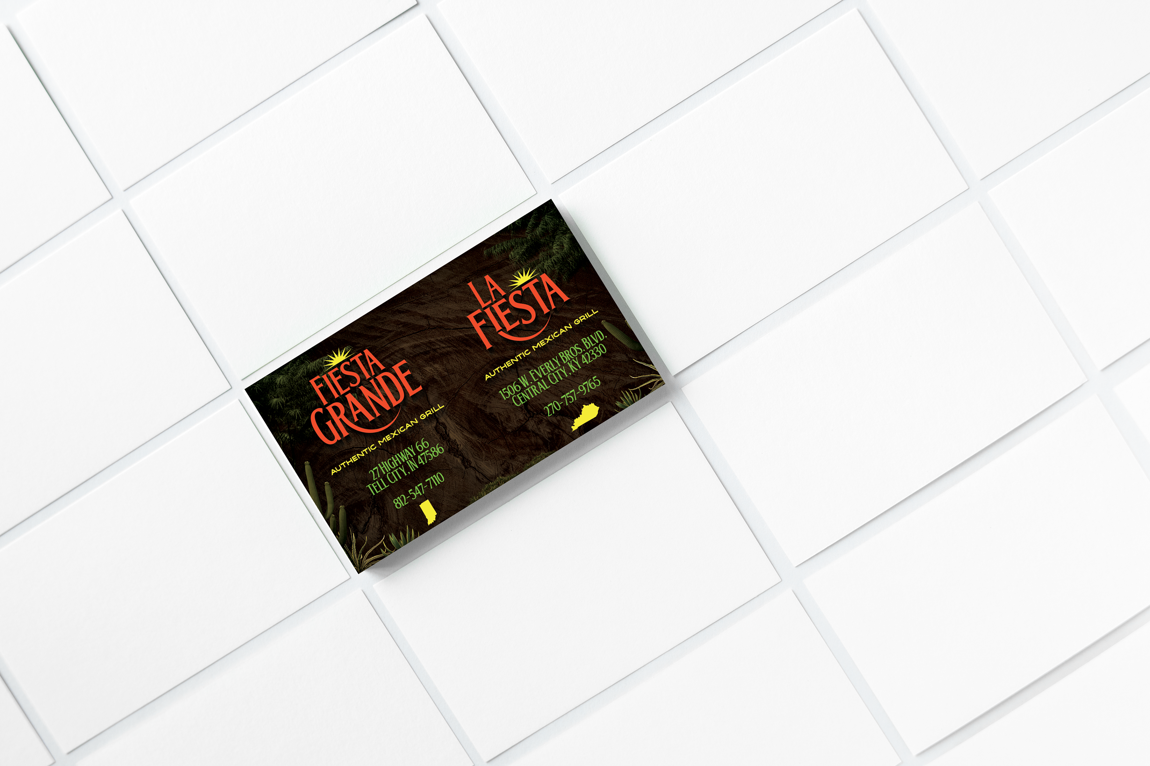
BUSINESS CARD:
I made the business cards in the same style as the menus to maintain consistency across the things that customers can potentially get ahold of. This business card advertises both restaurants because there are only two locations as of now, and the same card can be used at both locations.
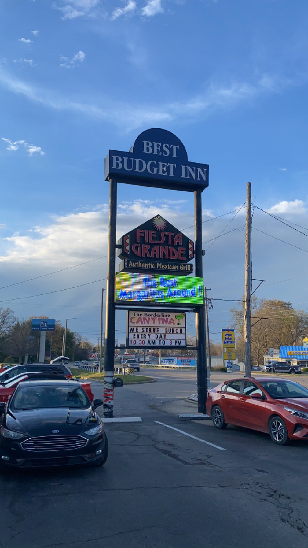
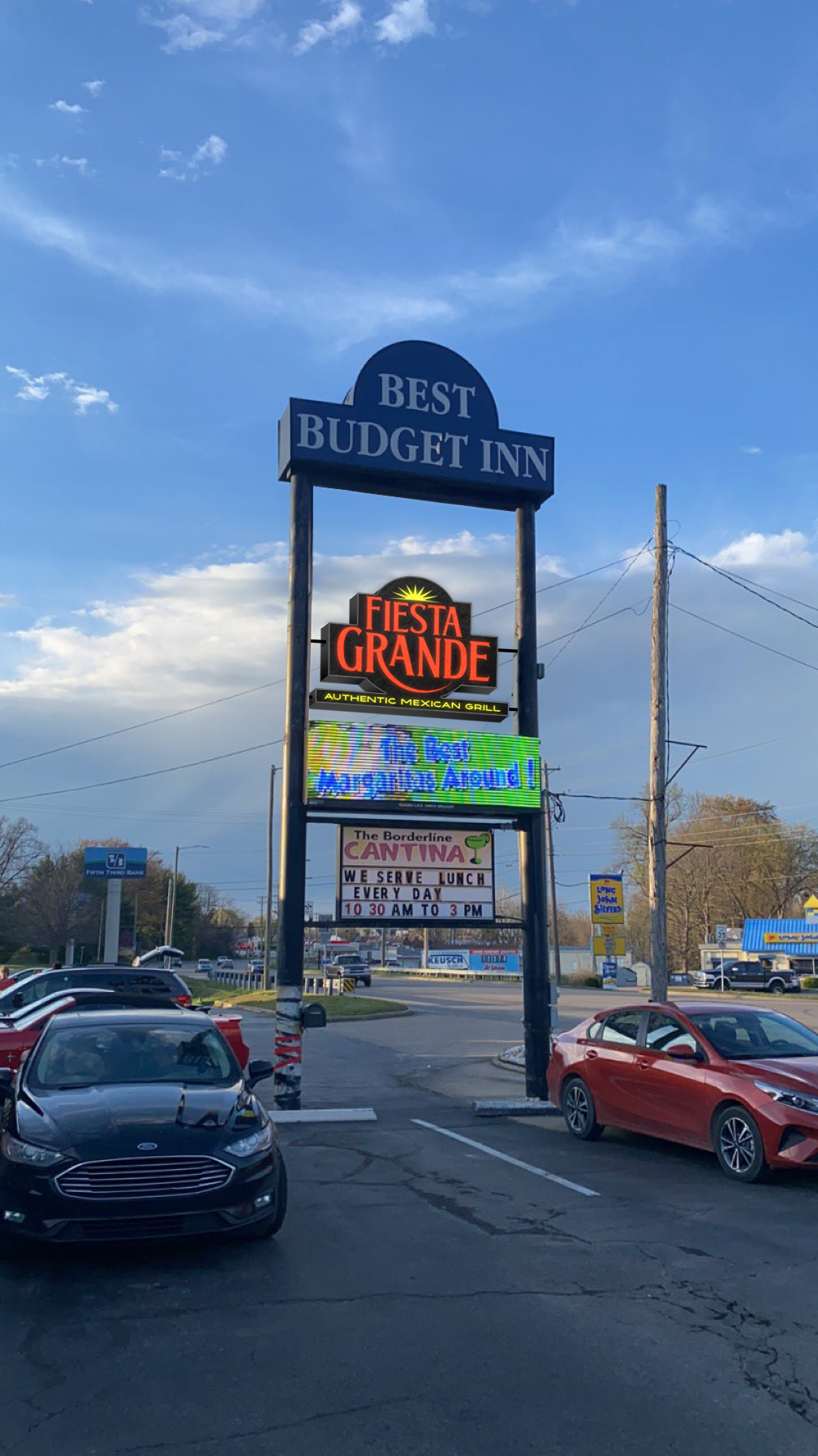
SIGNAGE:
This is my proposal for a new sign later on down the line. I think a new type of sign would be an appropriate thing to do for this particular logo and would help to get customers in when it gets dark. My design would include a flat sign with red dyed, clear plastic with light in the background. I've also taken into consideration the fact that the sign will have to be illuminated on both sides so the black boarder of the sign is equal on each side.
“I'm convinced that anyone who doesn't like Mexican food is a psychopath.”
-Jim Gaffigan
-Jim Gaffigan