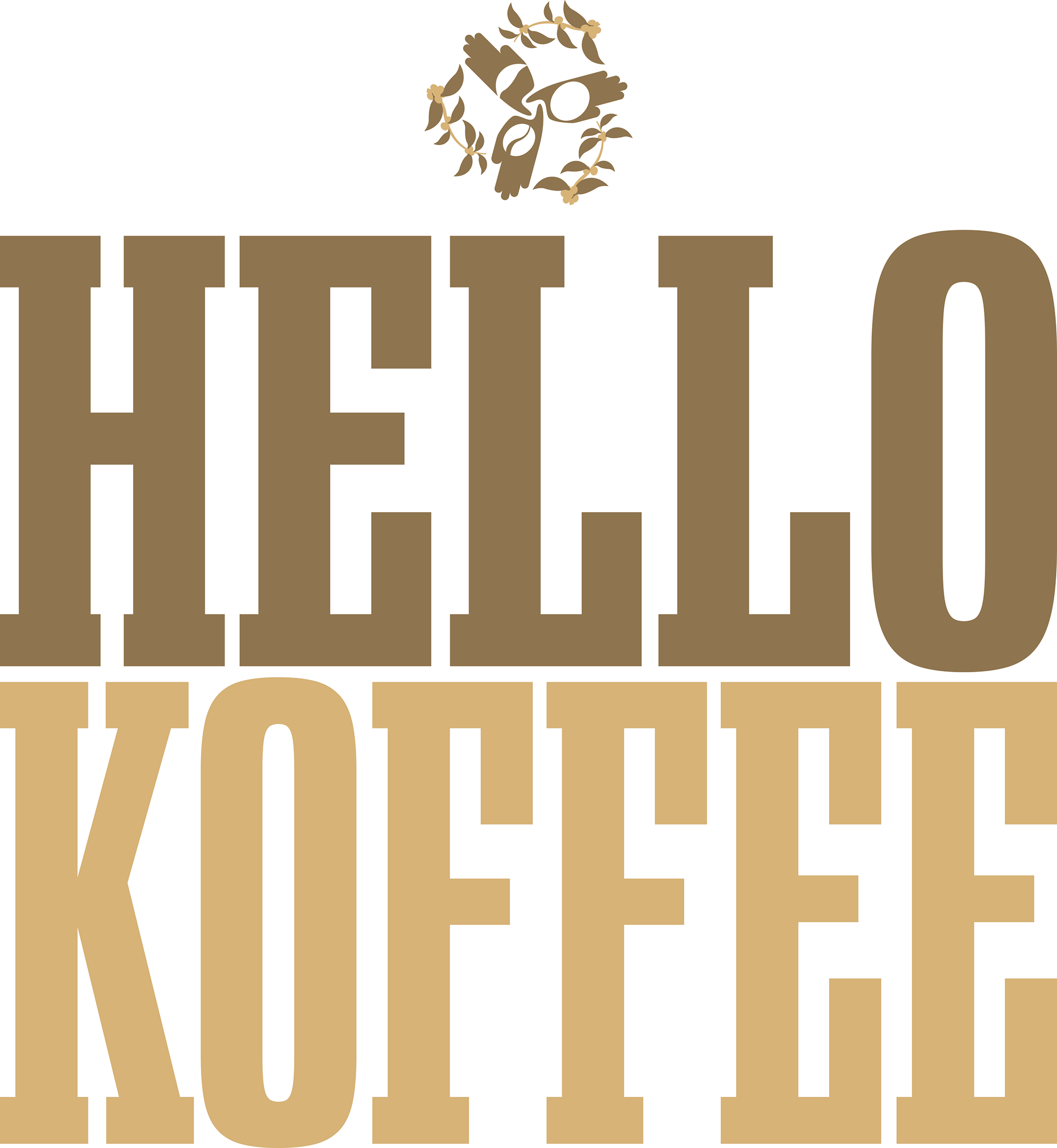
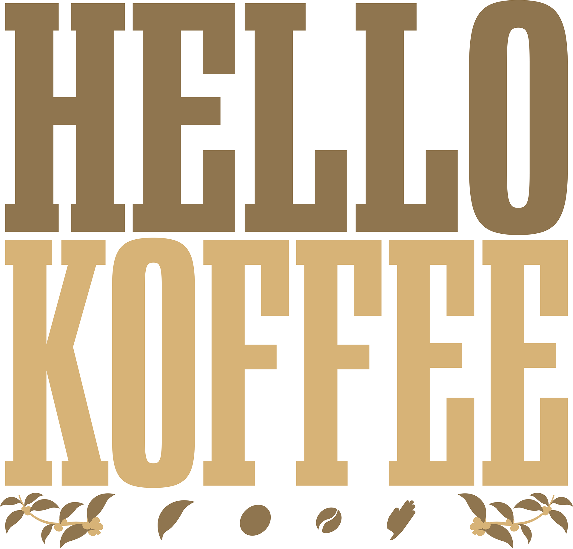
Hello Koffee
Logo Design Project
Logo Design Project
***All visuals, concepts, and ideas were creative directed and/or executed by GARDNERstudio***
THE GOAL:
Hello Koffee was a referral project from a friend who's logo I also designed (Clifton Blake World). Hello Koffee is a coffee journalism company with 1,000+ followers and 150,000+ engagements. They post around one short-form video per week in which they document an experience at a particular coffee shop. These videos add foot-traffic to the business.
Hello Koffee was a referral project from a friend who's logo I also designed (Clifton Blake World). Hello Koffee is a coffee journalism company with 1,000+ followers and 150,000+ engagements. They post around one short-form video per week in which they document an experience at a particular coffee shop. These videos add foot-traffic to the business.
No logo was being used at the time they reached out, so I was given free range to create what I felt fit.
After being reached out to by Hello Koffee, I was very excited to take on the project and produce something that the team was happy to have represent them.
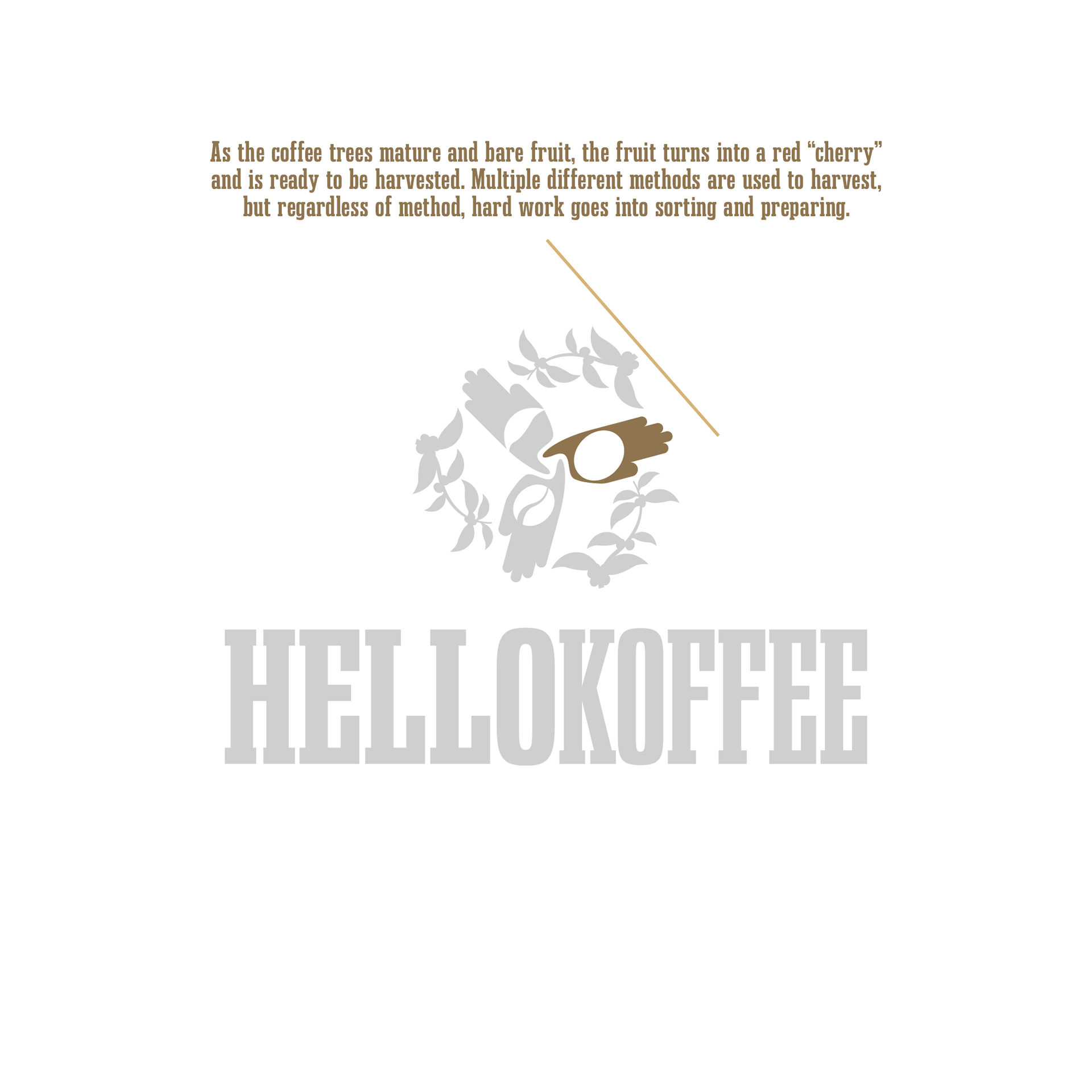
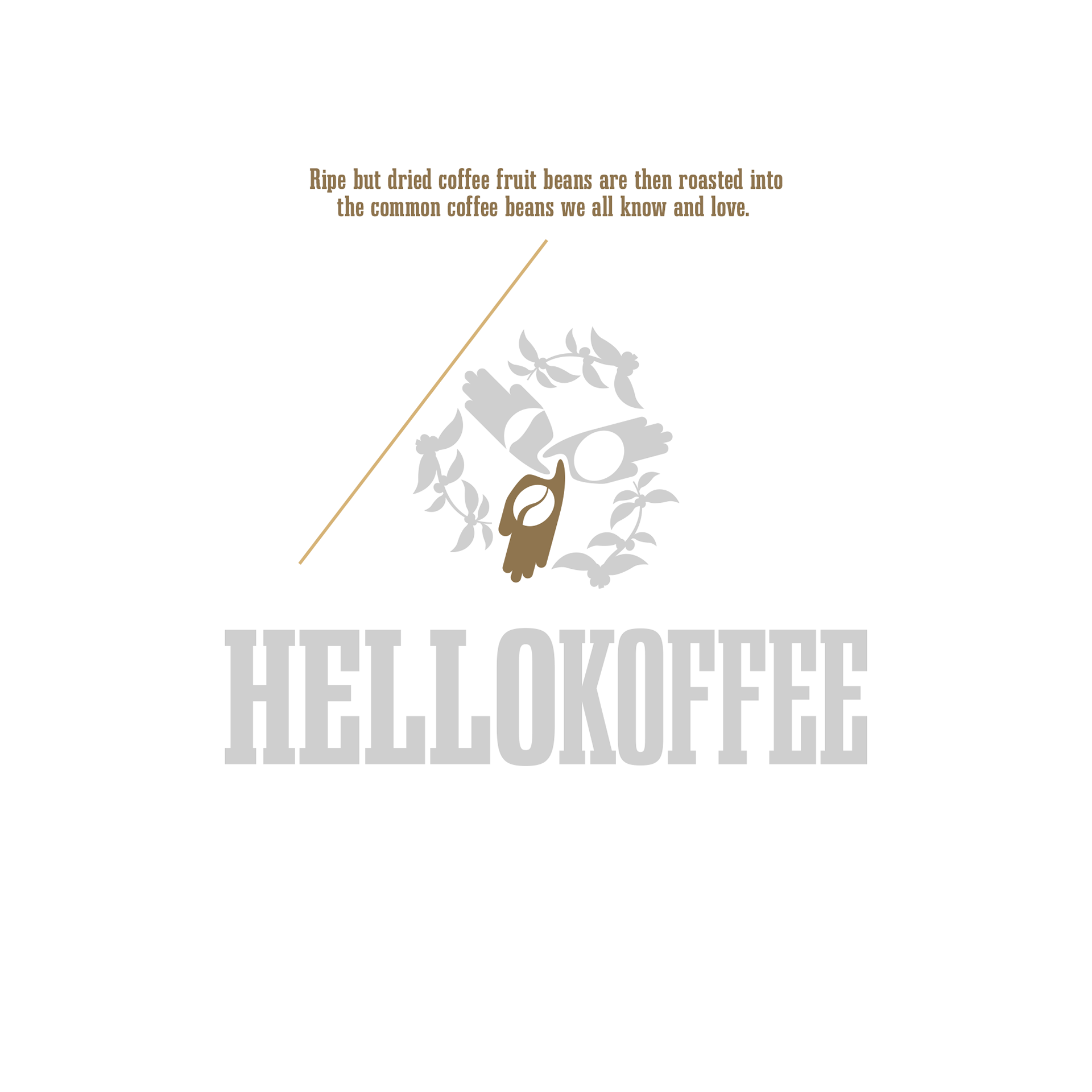
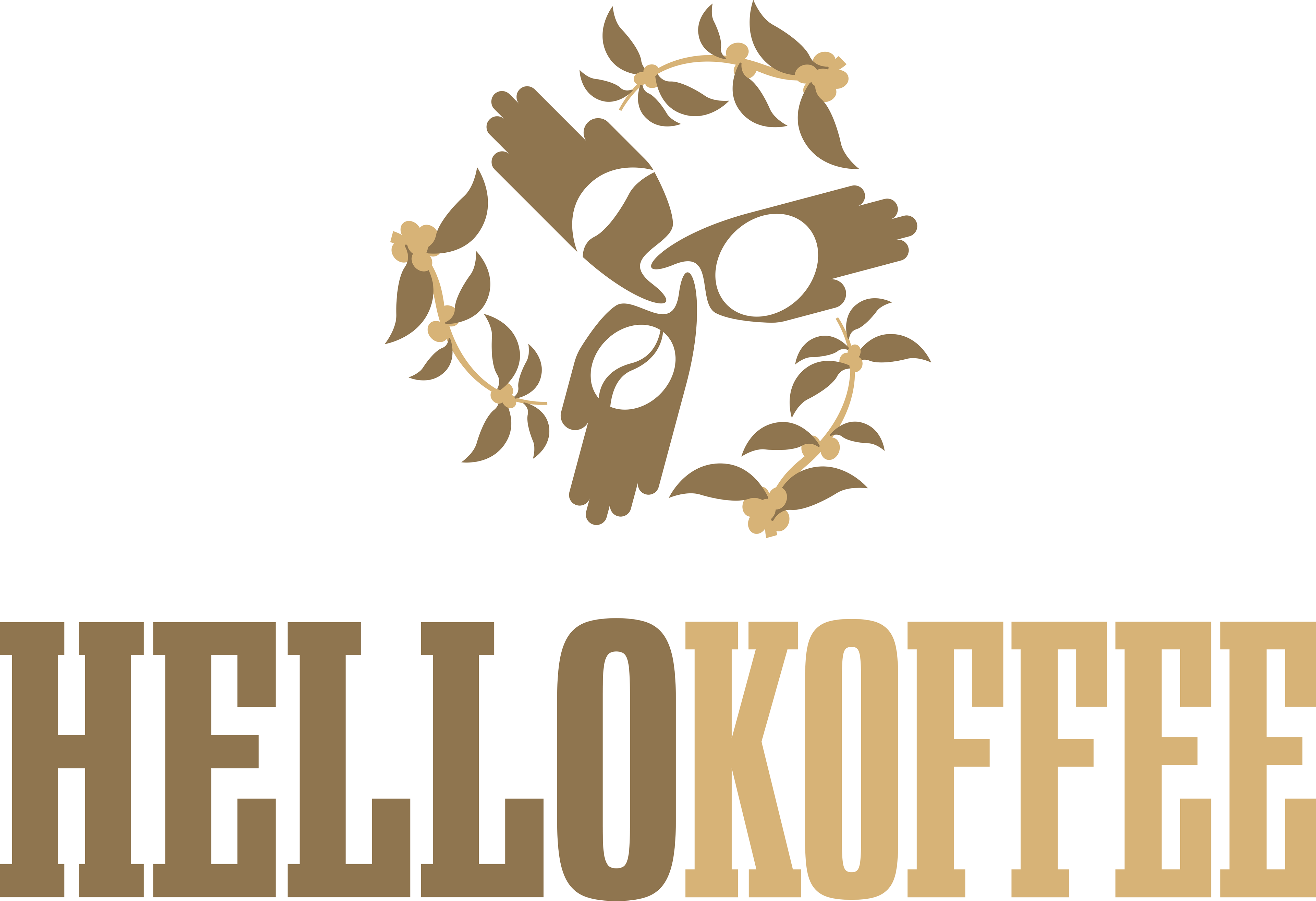
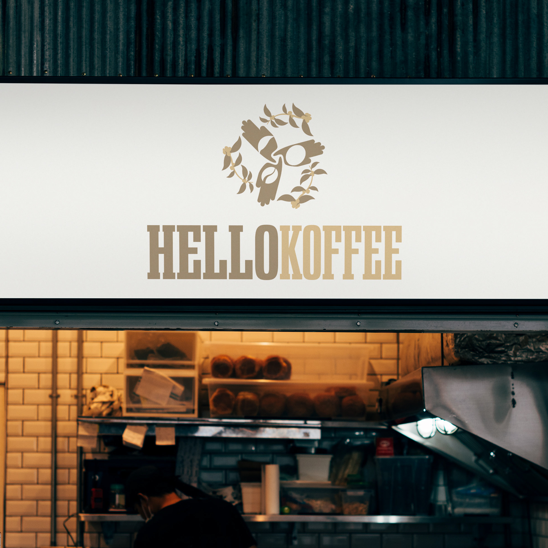
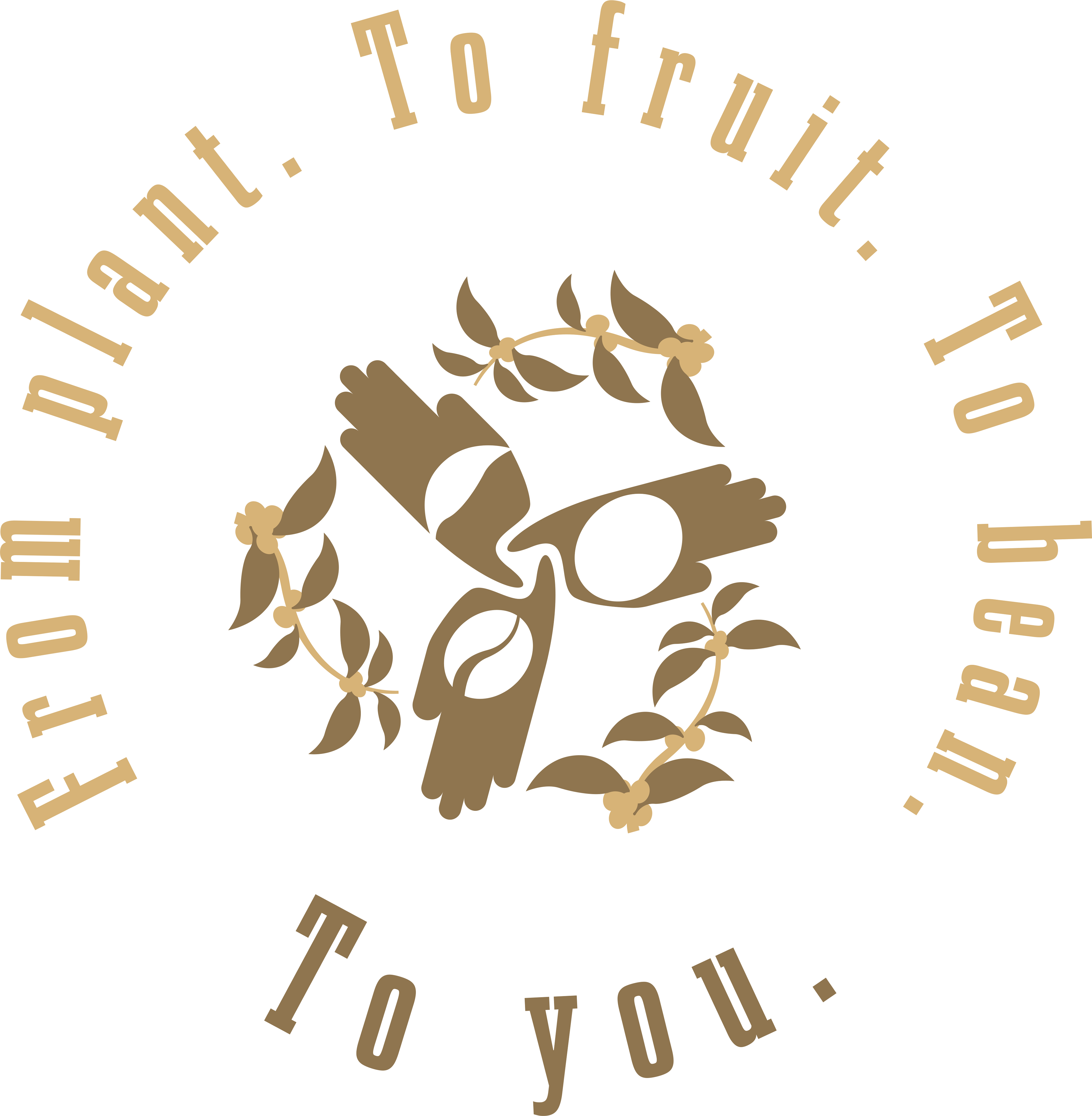
ICON BREAKDOWN:
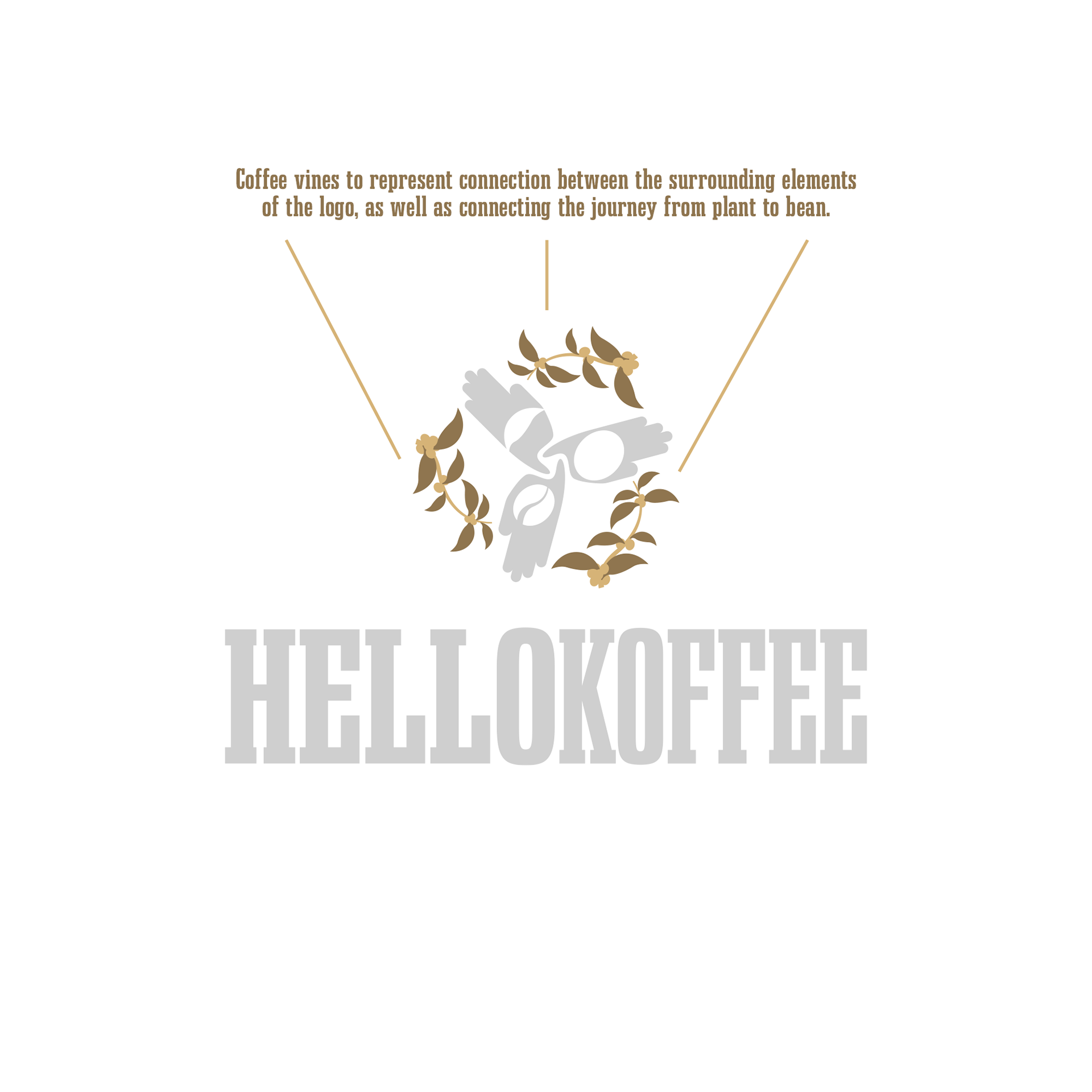
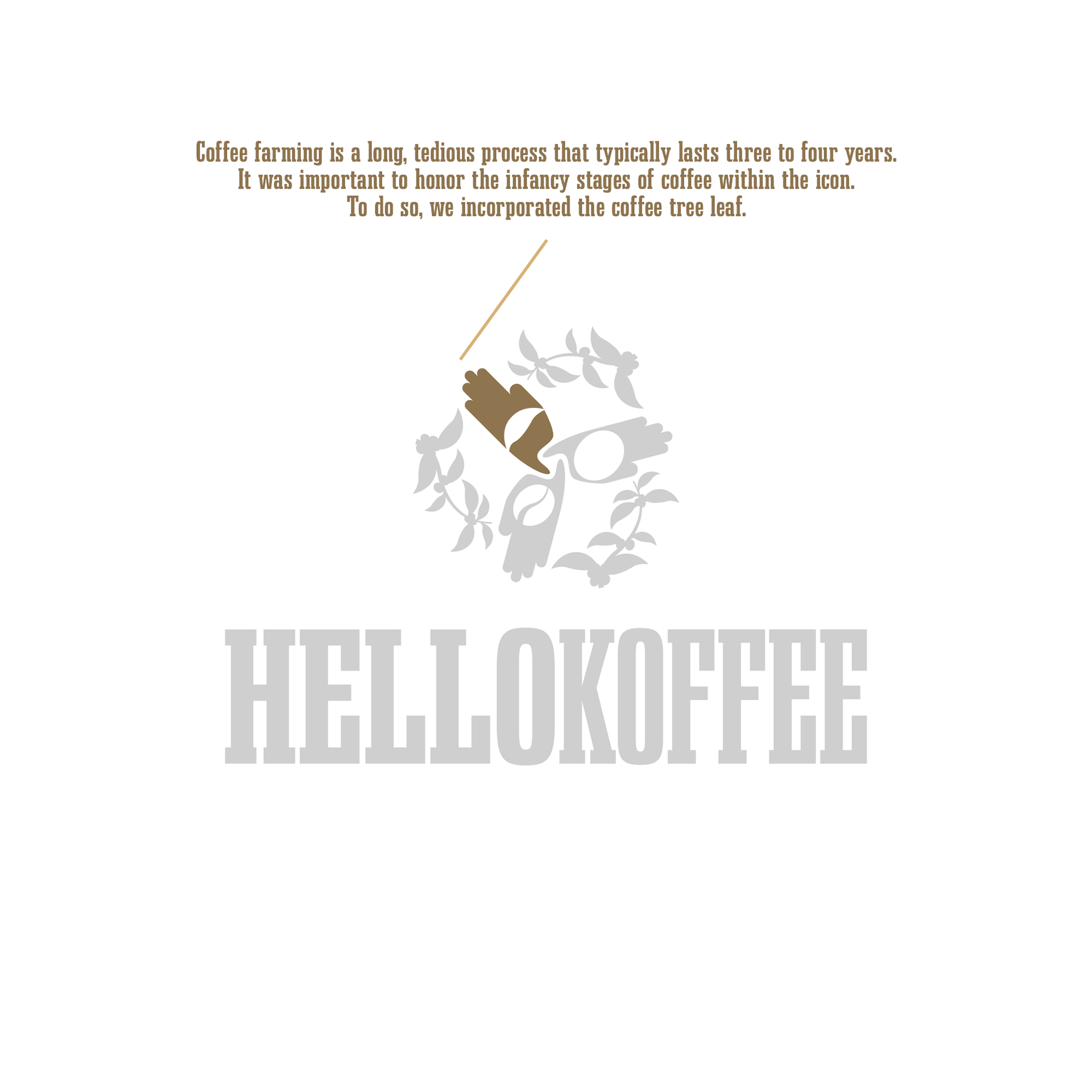
As mentioned above, Hello Koffee's mission is not only meant to honor coffee shops, but the people who dedicate their lives to the growing, harvesting, and brewing the coffee. Hello Koffee (and the link between then) is represented by the vines connecting each part of the process.
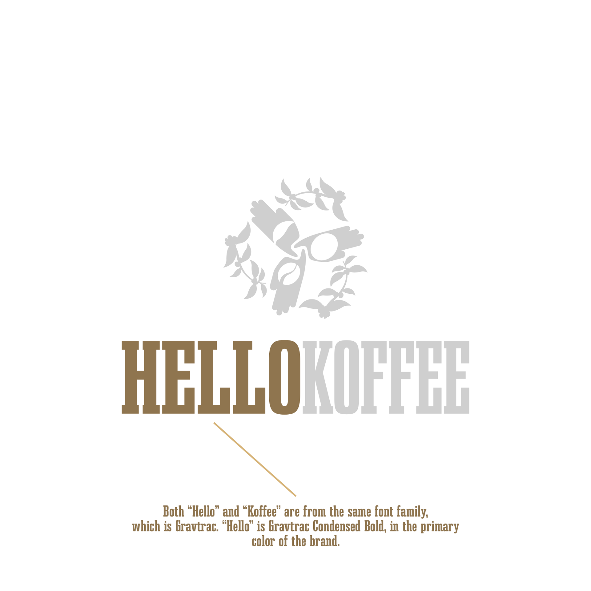
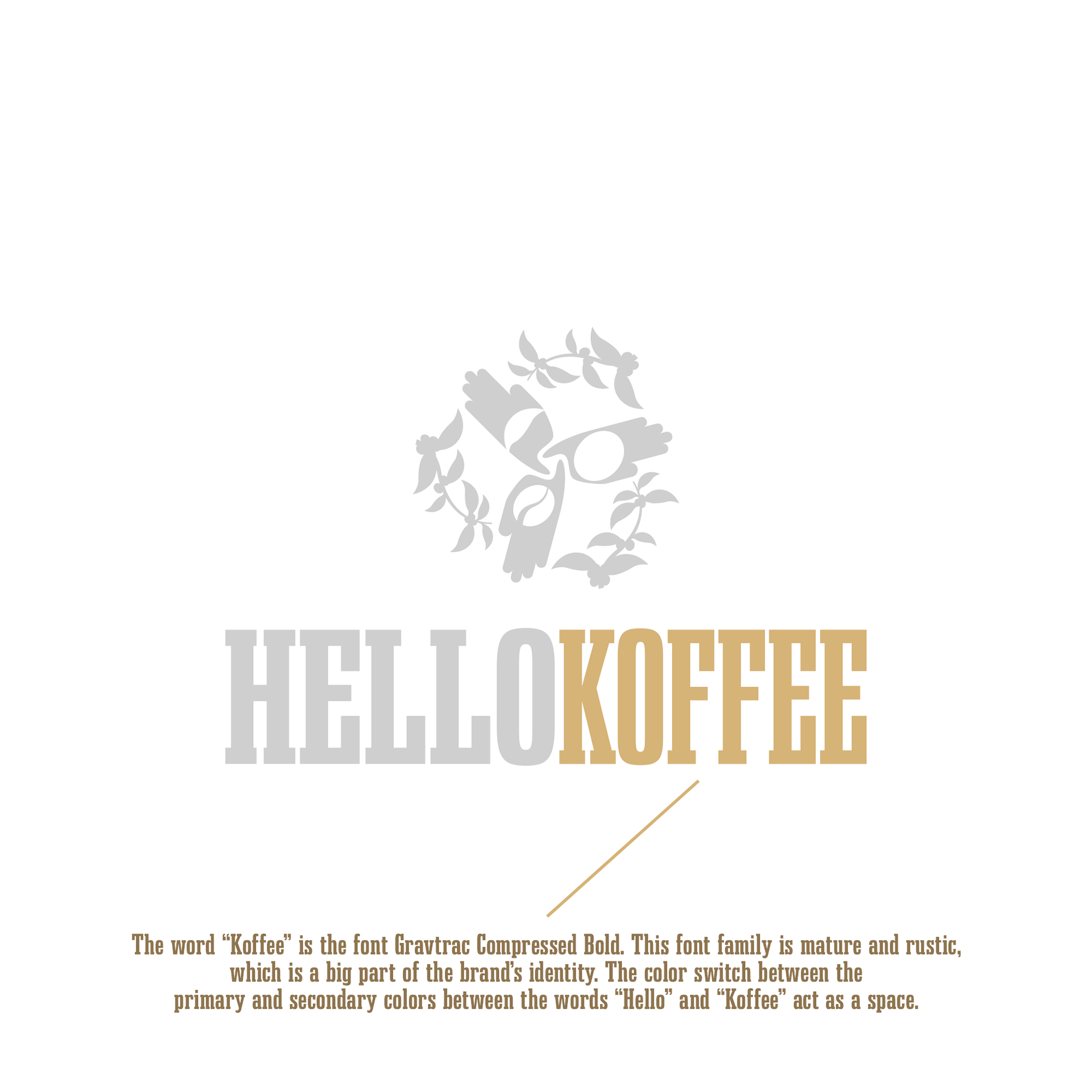
FONT CHOICE:
After scouring through hundreds of fonts on the internet, I found the perfect font that compliments the icon in a great way. That font is called "Gravtrac" and was actually a free-to-use font which was chosen to accommodate my client's budget. Fonts don't have to be hundreds of dollars to work great with a brand.
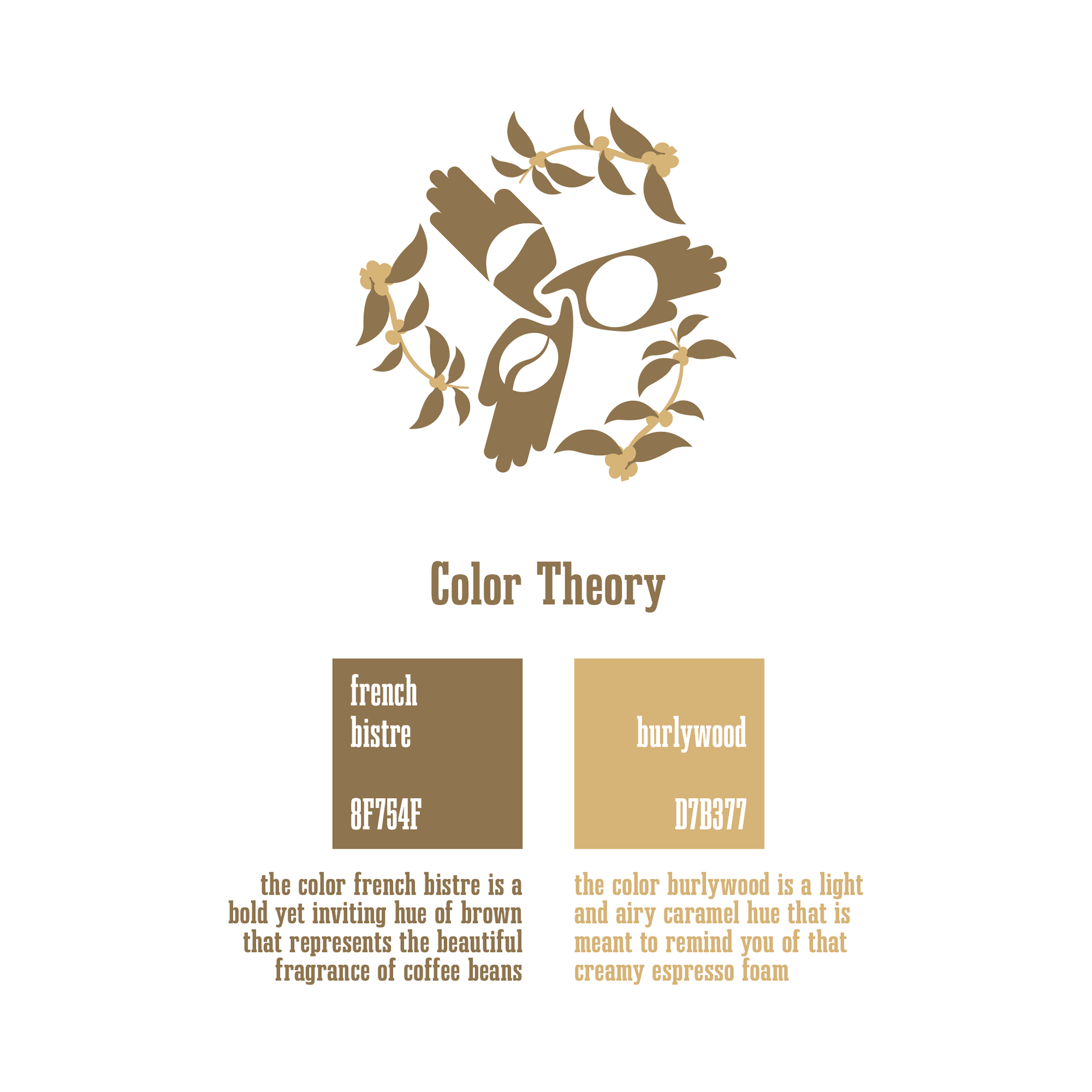
COLOR PALETTE:
French bistre and burlywood are two perfect shades of brown that go well with coffee and compliment the brand. They're also meant to represent coffee and expresso foam.
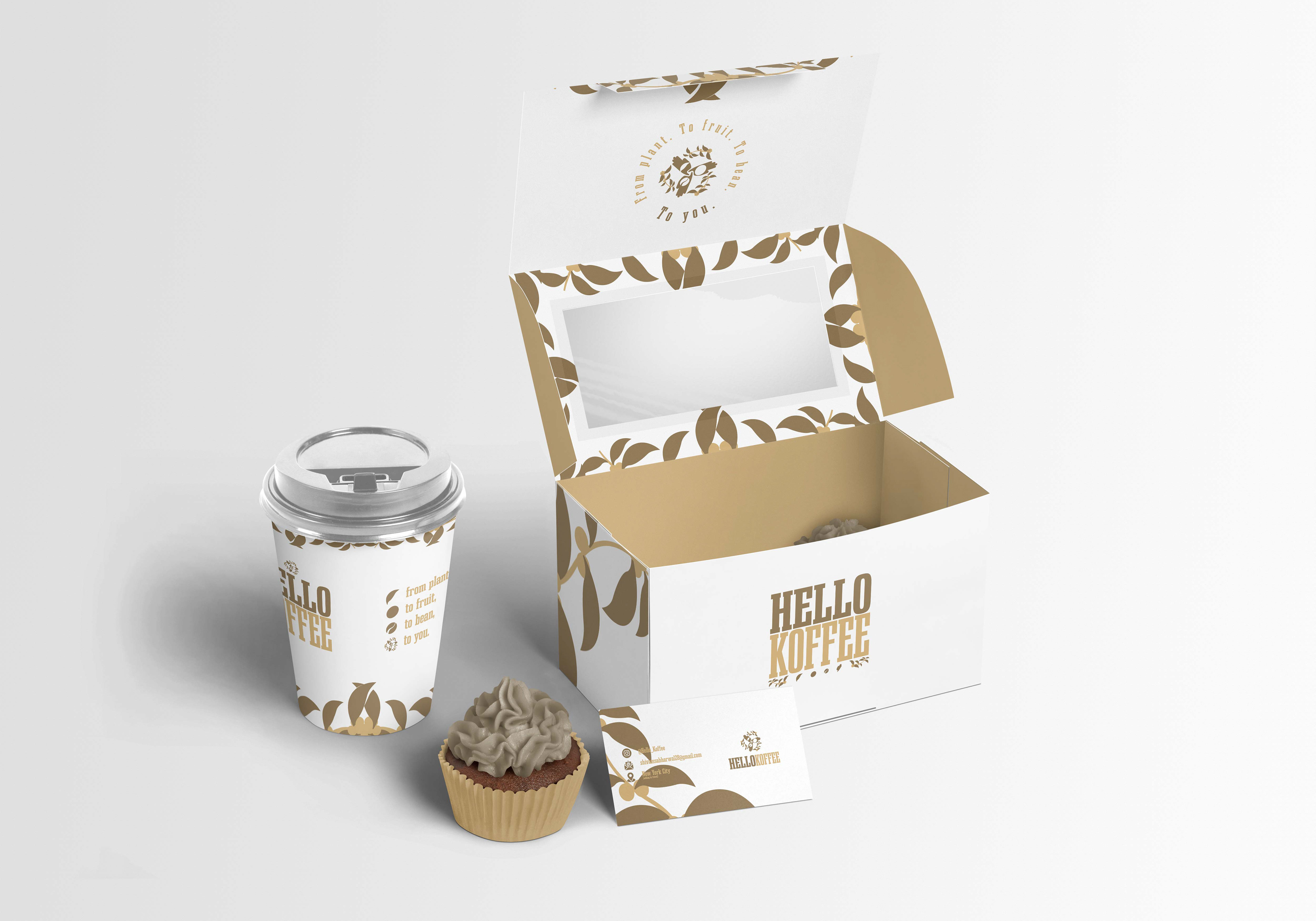
APPLICATIONS:
The Hello Koffee logo has proven to be versatile and useful icon that the brand loves. Whether it's stationary designs, to billboards, or online advertisements, the Hello Koffee logo and branding is perfectly eye catching enough for the target market to get engaged.

“Coffee is a language in itself.”
-Jackie Chan
-Jackie Chan