Marine Express Lube
Logo Redesign Project
Logo Redesign Project
***All visuals, concepts, and ideas were creative directed and/or executed by GARDNERstudio***
THE GOAL:
Marine Express Lube was a potential client from a good friend of mine. He approached me on behalf of one of his friends who was in great need of an updated look for his business. Previously, his logo was rough, grungy, and overall unfit to represent the work they produced. Marine Express Lube does oil changes for luxury yachts that range anywhere from 50 to 100 feet in length.
Marine Express Lube was a potential client from a good friend of mine. He approached me on behalf of one of his friends who was in great need of an updated look for his business. Previously, his logo was rough, grungy, and overall unfit to represent the work they produced. Marine Express Lube does oil changes for luxury yachts that range anywhere from 50 to 100 feet in length.
I was surely up to the task and excited to make something that represented the company in a more luxurious and fitting way.
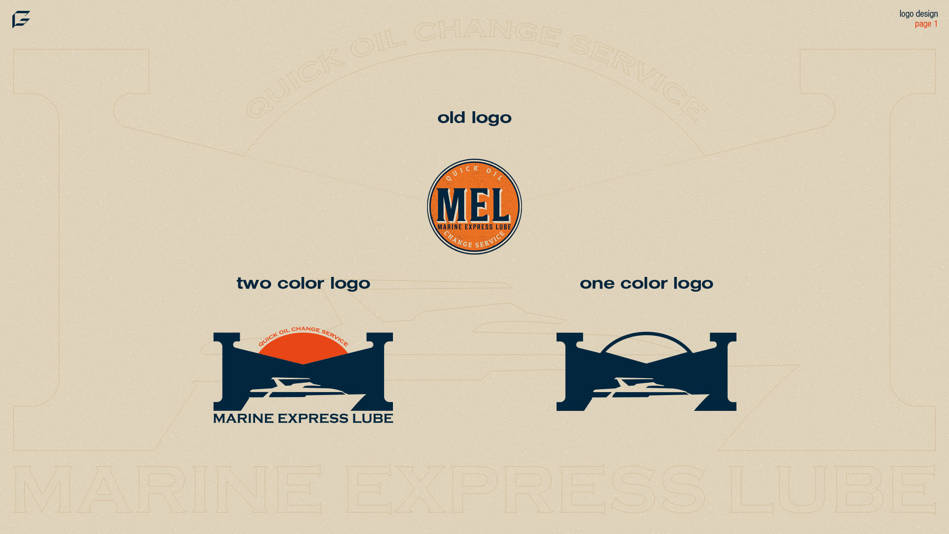
OLD AND NEW LOGO COMPARISON:
The first page of the presentation was showing the old logo and the new logo in the same slide. This is important for me as an initial step as it acts as a "wow factor" and typically makes clients extremely excited for the future of the look of their brand (even if they decide to request changes).
When anyone sees your logo, particularly a potential customer, it should be an instant connection. Sometimes logos can be too wordy and try to over explain what they do, which isn't the job of the logo.
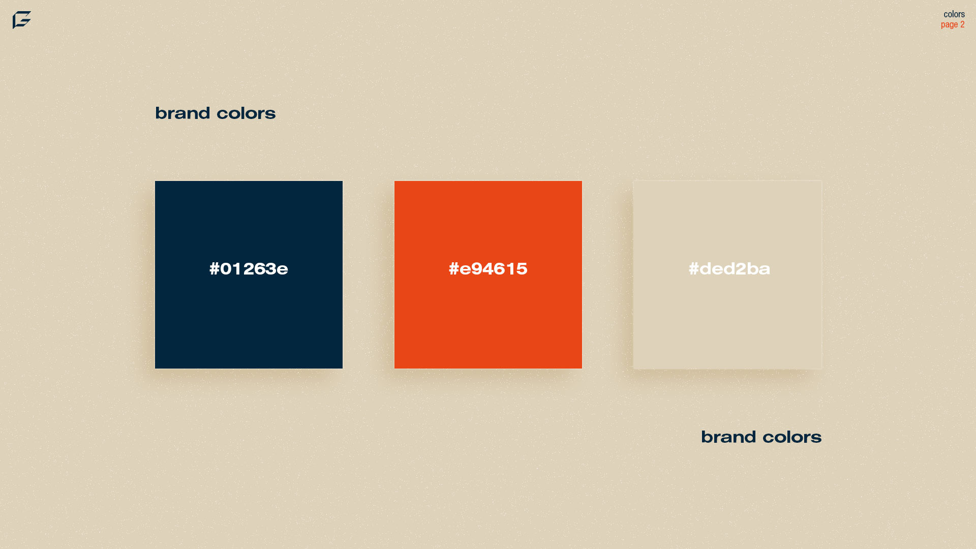
COLOR PALETTE:
Largely, the color palette for my rebrand proposal is the same as the previous one. Colors are an extremely important part of a brand's identity, and often have more powerful effects on brand recognition over the logo. There were some slight changes to the shade of the orange to better represent a sunset.
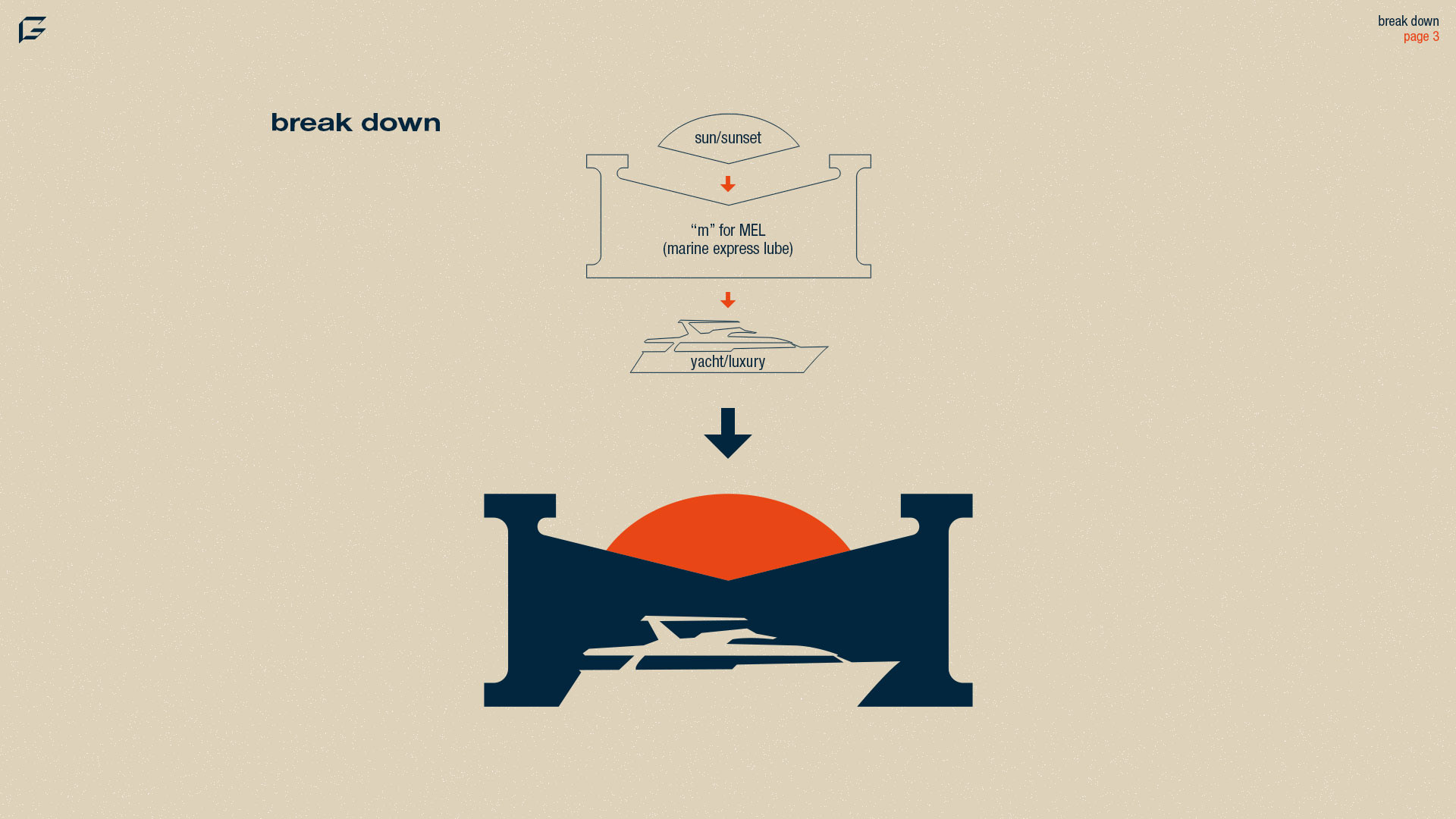
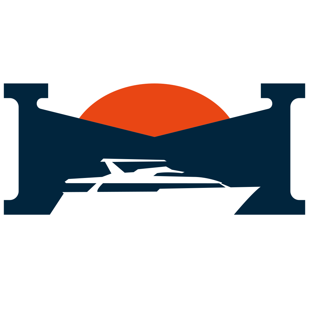
LOGO CREATION BREAKDOWN:
When approaching the actual creation of the logo, I was keen on choosing between three elements and combining them in a harmonious final product. These three elements were;
Sunset: The sunset represents the sunshine state of Florida, which Marine Express Lube is based out of. Specifically, Jacksonville Florida.
Letter M: The letter "M" of course represents MEL or Marine Express Lube.
Yacht: Marine Express Lube works primarily with yachts, so it only made sense to add a yacht to incorporate the luxurious marine vehicles they work on.
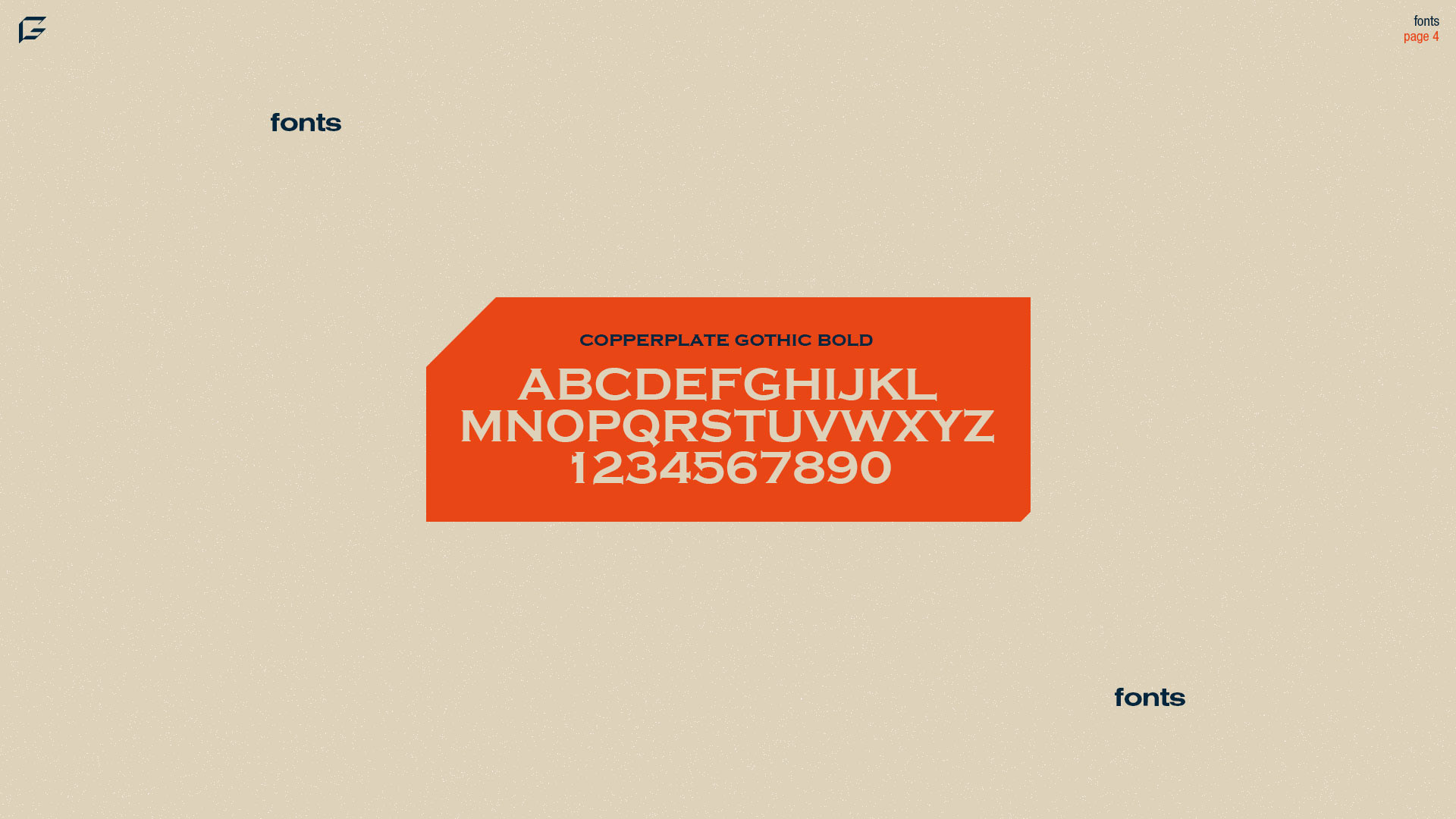
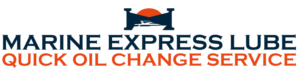
FONT CHOICE:
Copperplate Gothic Bold is a nice, rustic font that pays homage to the type in the previous logo. Like a consistent color palette, similar font structure is great for brand recognition.
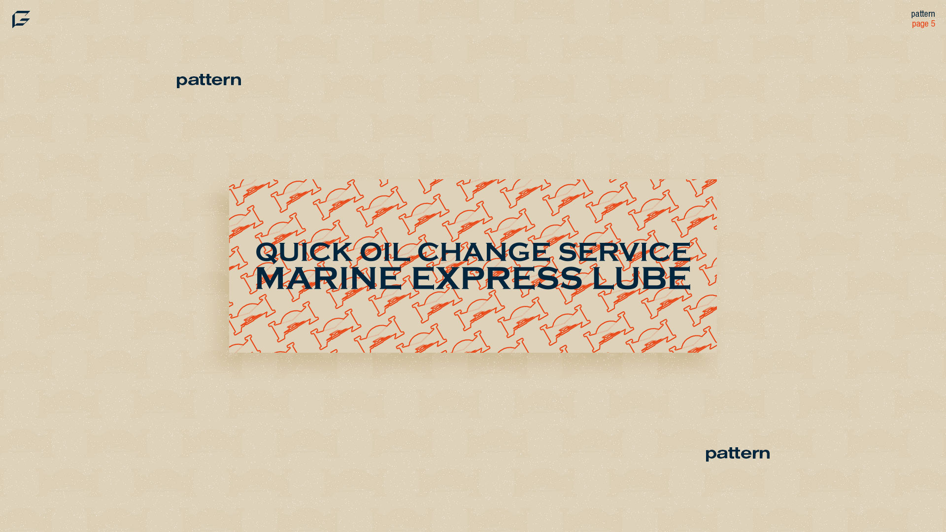
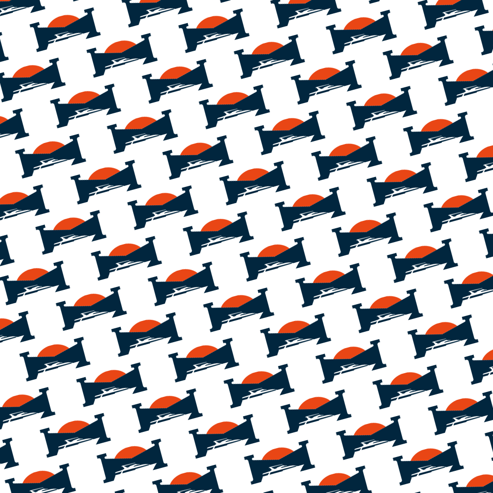
BRAND PATTERN:
Several brands utilize patterns for their brands. Patterns can add to overall customer experience in a variety of ways including but not limited to website footer, business cards, and packing paper!
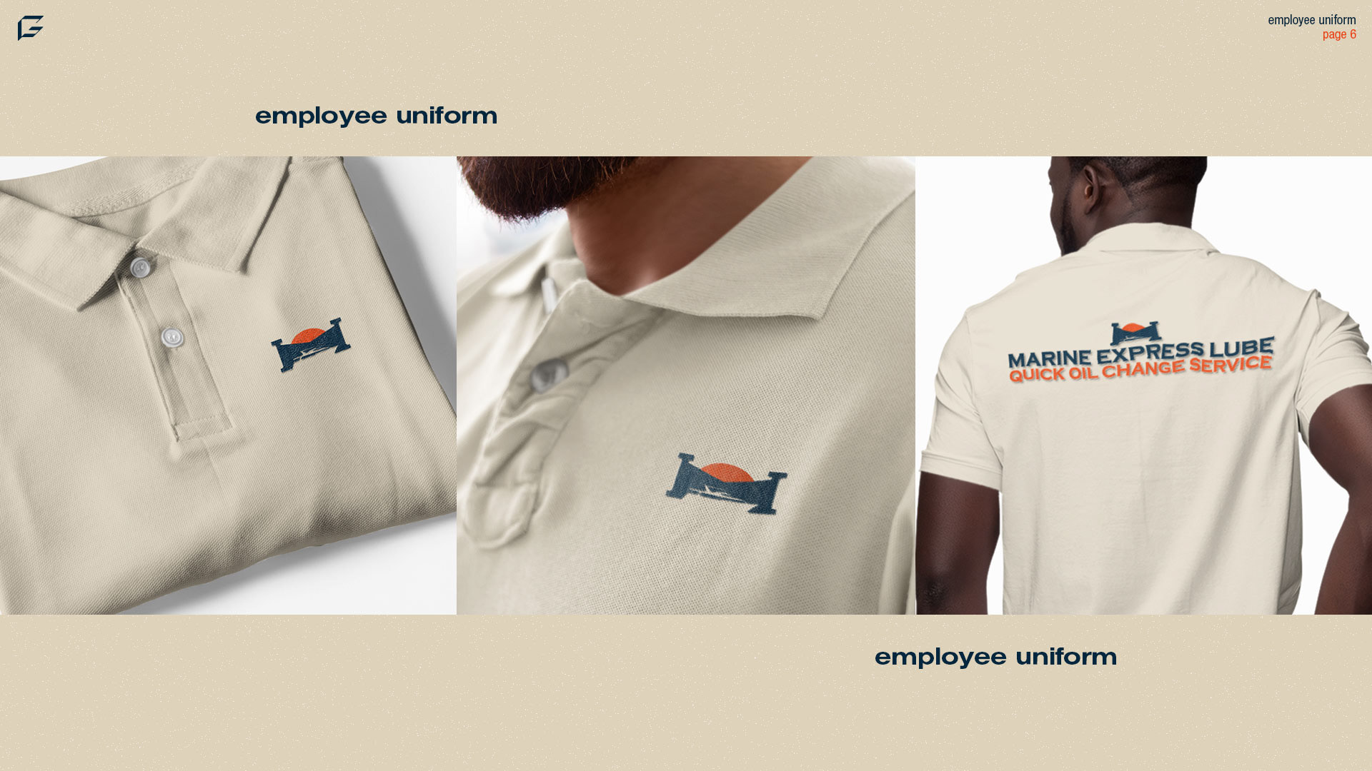
EMPLOYEE UNIFORM:
Employee uniforms are extremely important for companies in order for employees to feel like they're a part of the same team. Representing the same team bring employees together.
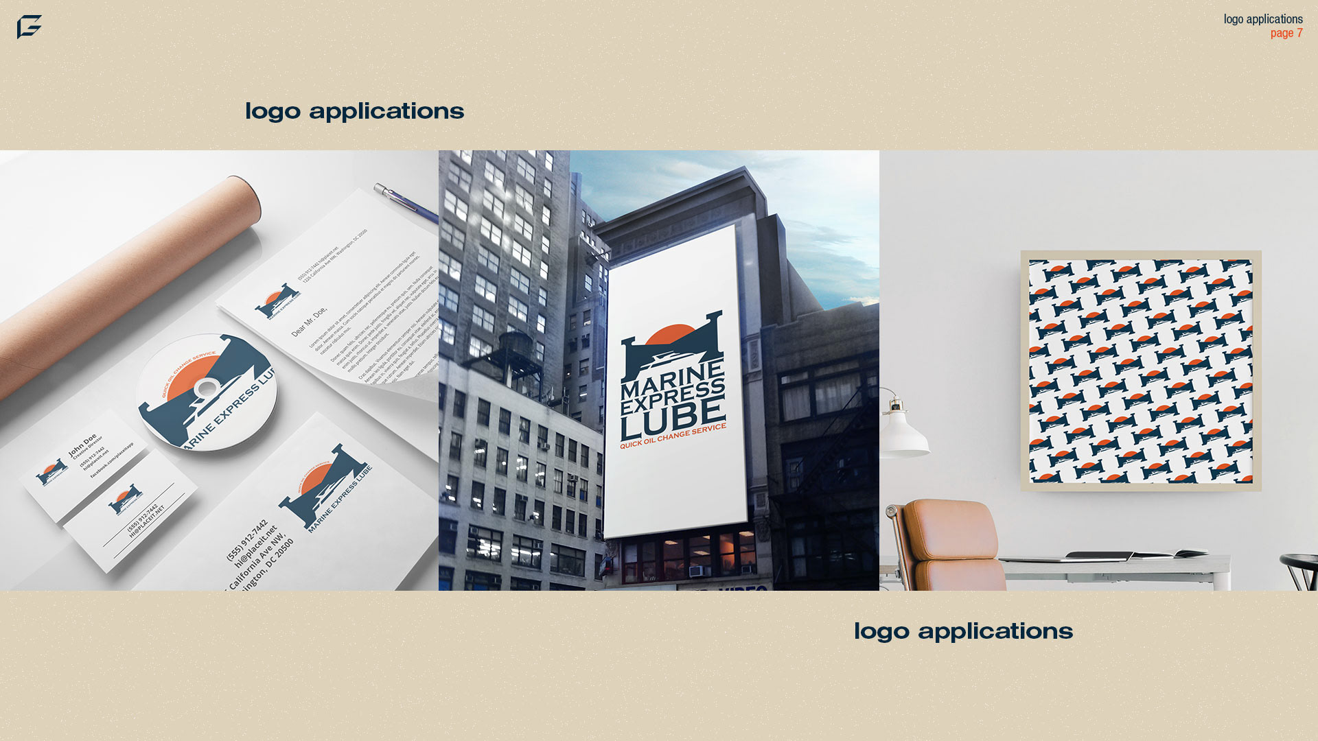
APPLICATIONS:
Branding is much more than logo design and often logo design is a small part of the larger scheme. Logos are nothing without their ability to adapt in certain situations and to be able to mold to specific mediums.
“Live in the sunshine, swim the sea, drink the wild air.”
-Ralph Waldo Emerson
-Ralph Waldo Emerson