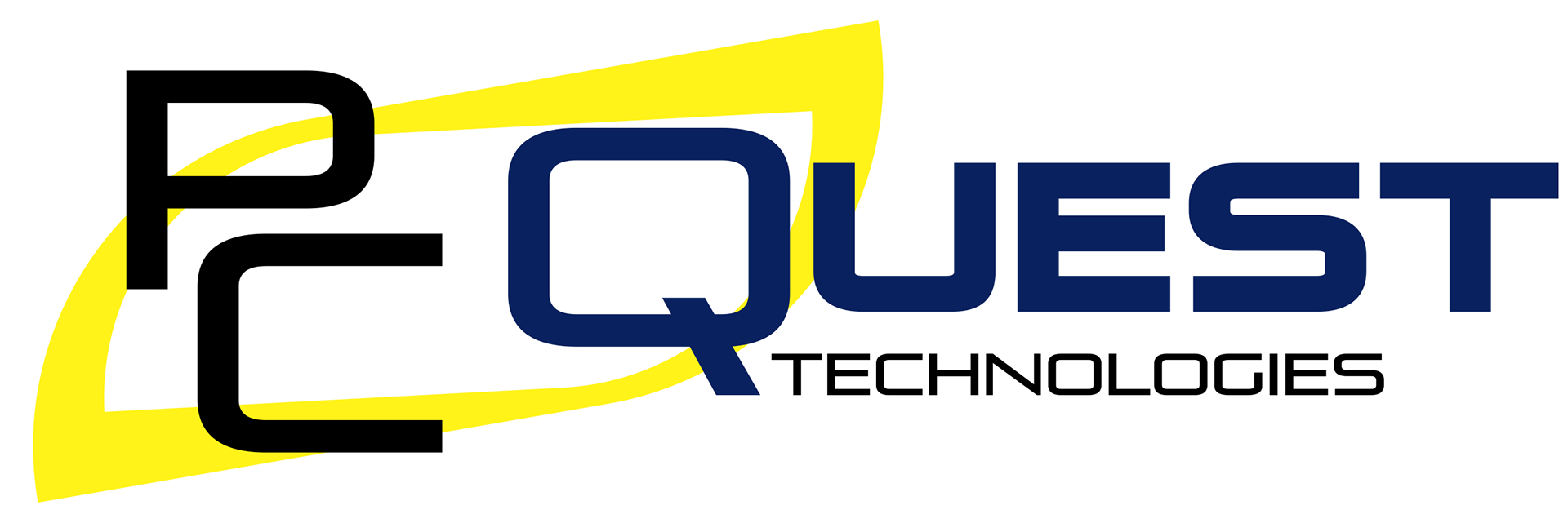
PC Quest Technologies
Logo Redesign Project
Logo Redesign Project
***All visuals, concepts, and ideas were creative directed and/or executed by GARDNERstudio***
THE GOAL:
PC Quest Technologies is a computer IT company that builds computers, does virus removal, repairs smart phones, recovers data, repairs game consoles, and much more. The logo they're using out dated and doesn't match the energy of the brand and what it does.
PC Quest Technologies is a computer IT company that builds computers, does virus removal, repairs smart phones, recovers data, repairs game consoles, and much more. The logo they're using out dated and doesn't match the energy of the brand and what it does.
I decided I was going to make it my mission to make an up-to-date logo that was sleek and inspired by technology. To keep the brand's recognizability, I decided to keep the logo in a similar format with similar elements.
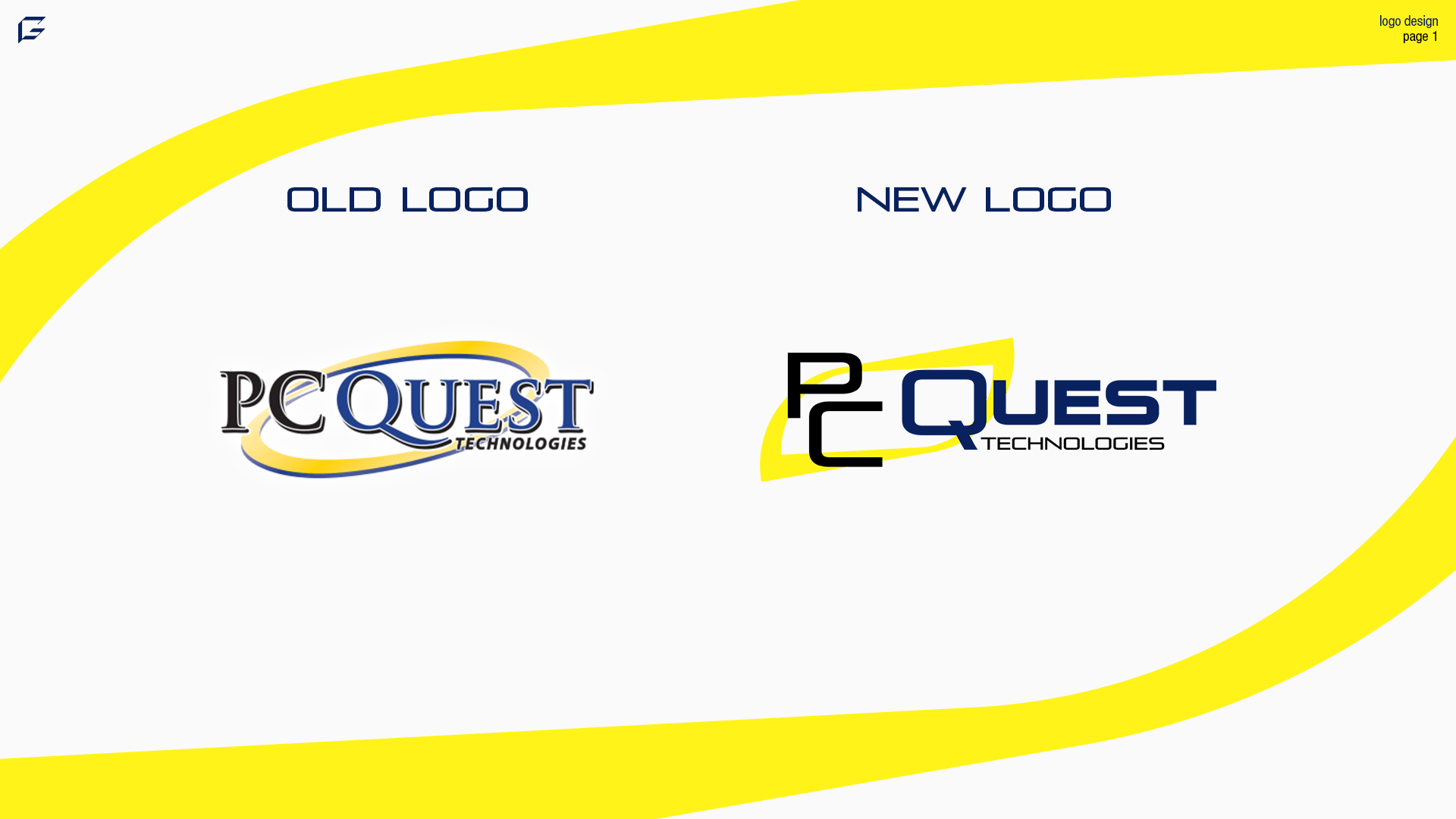
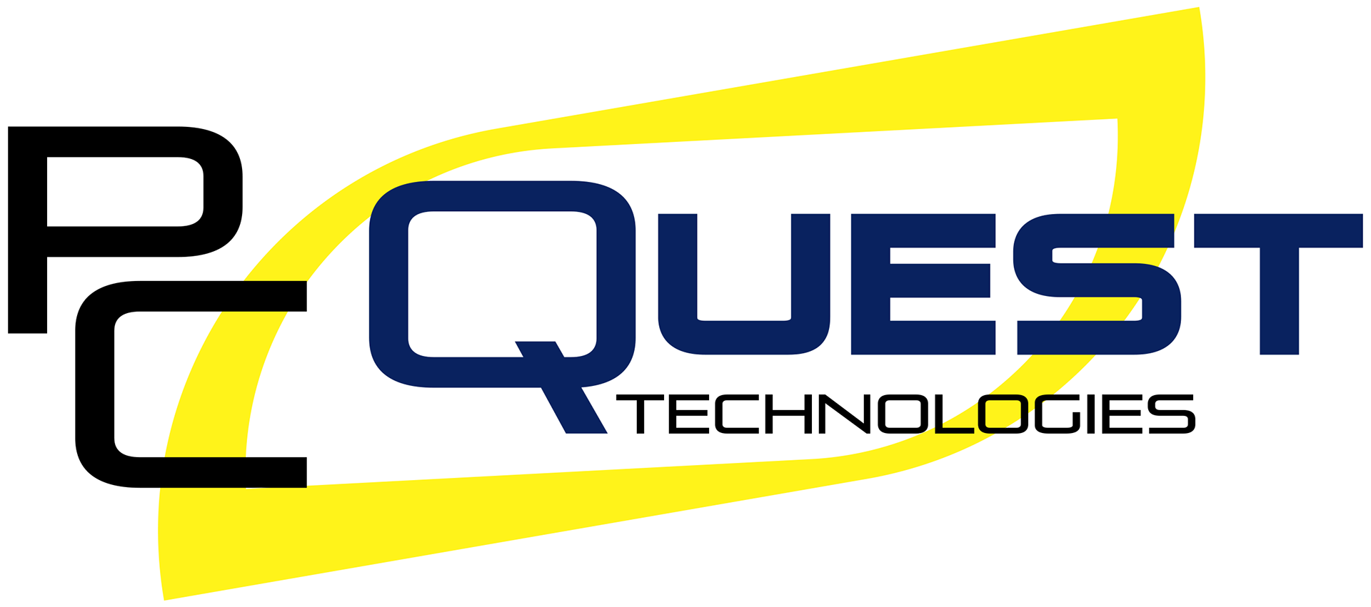
OLD AND NEW LOGO COMPARISON:
The old logo just doesn't fit the theme of the brand. Also, there are way too many elements to the logo, which are the outlines, drop shadows, and glows. It does have a unique quality to it, but it just needs to be brought to the newer times. Brands don't realize the importance of this and they often think that business isn't doing bad so there is no need. This just isn't the case. Brands owe it to their customers to stay looking fresh and evolving.
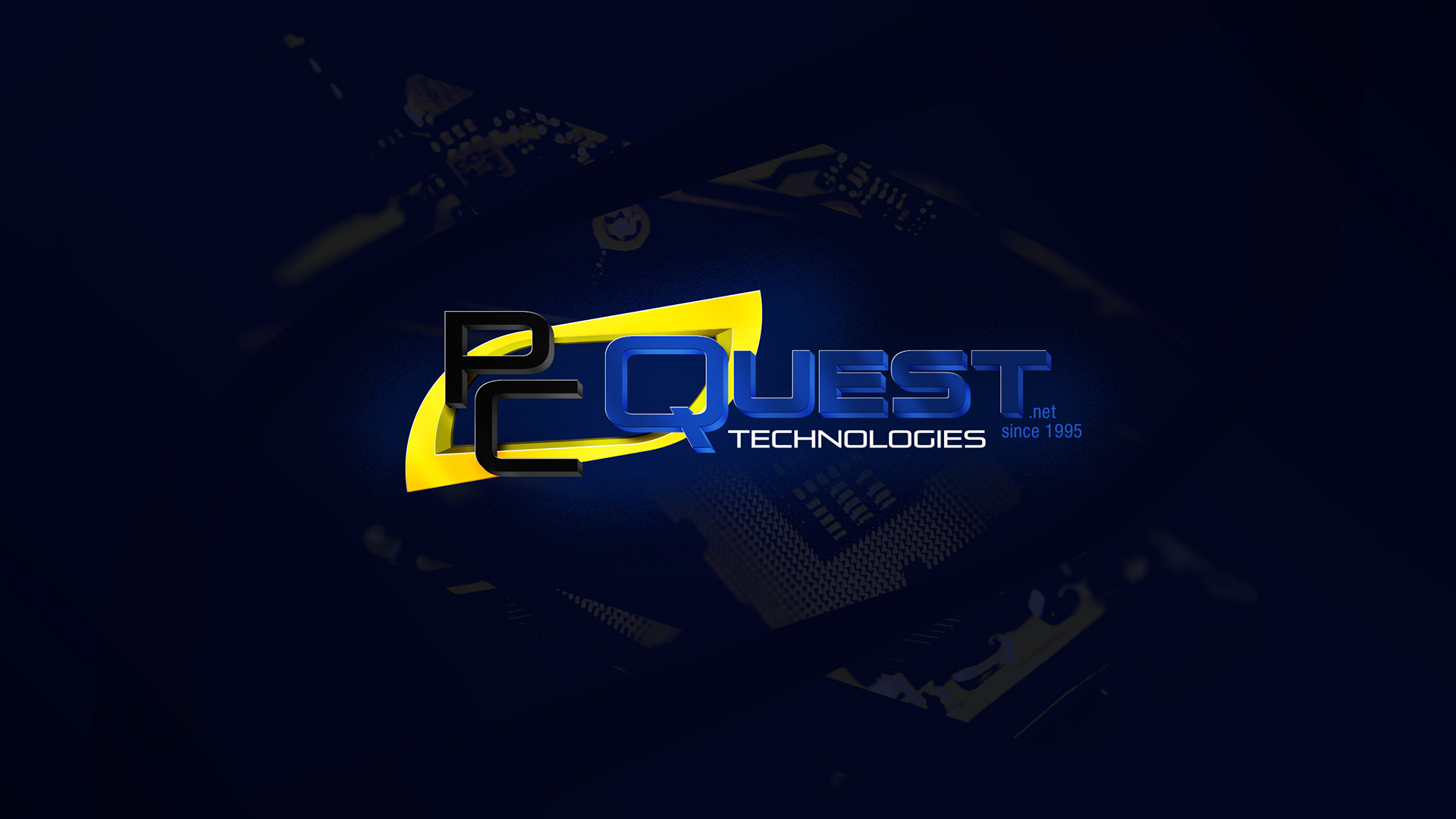
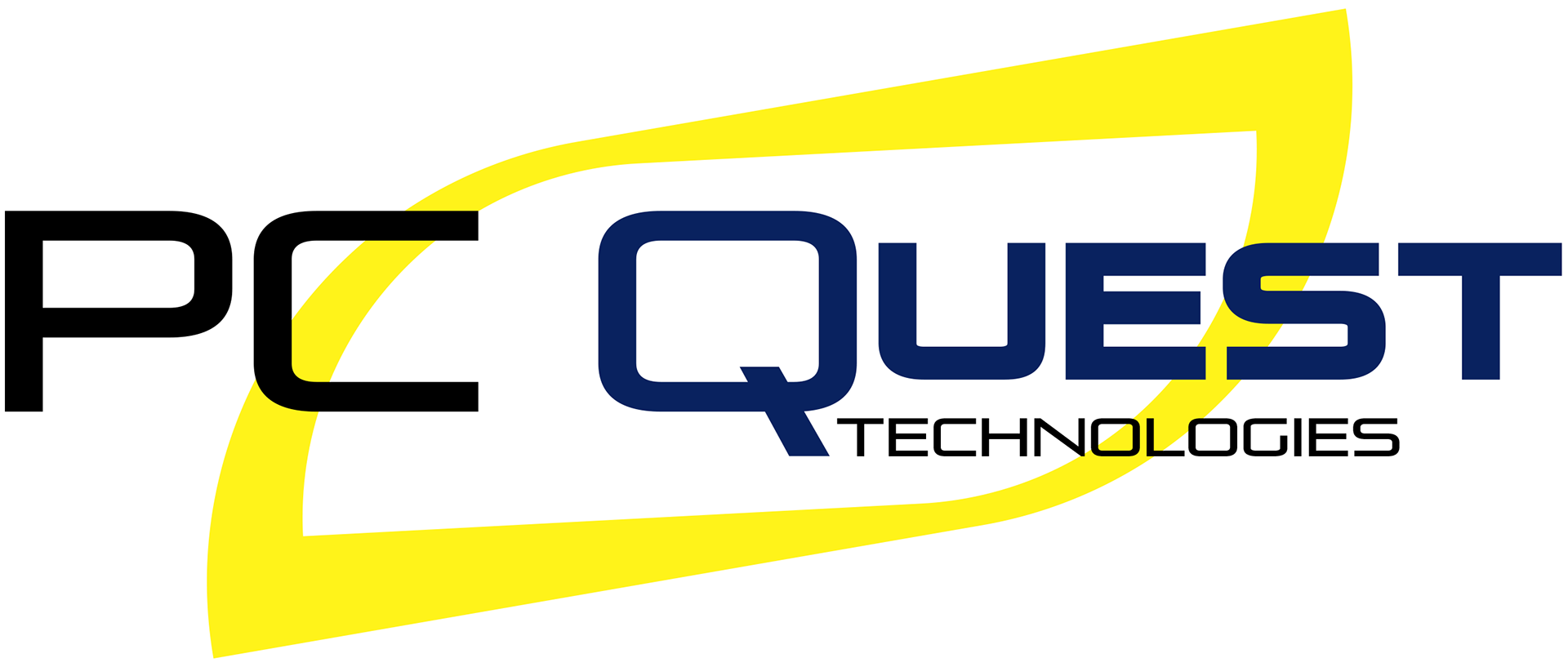
My updated concept does just that. Pays homage to all the elements of the old logo, but with a more technology-themed font. The background oval of the old logo is brought to the new logo with a more sharp twist.
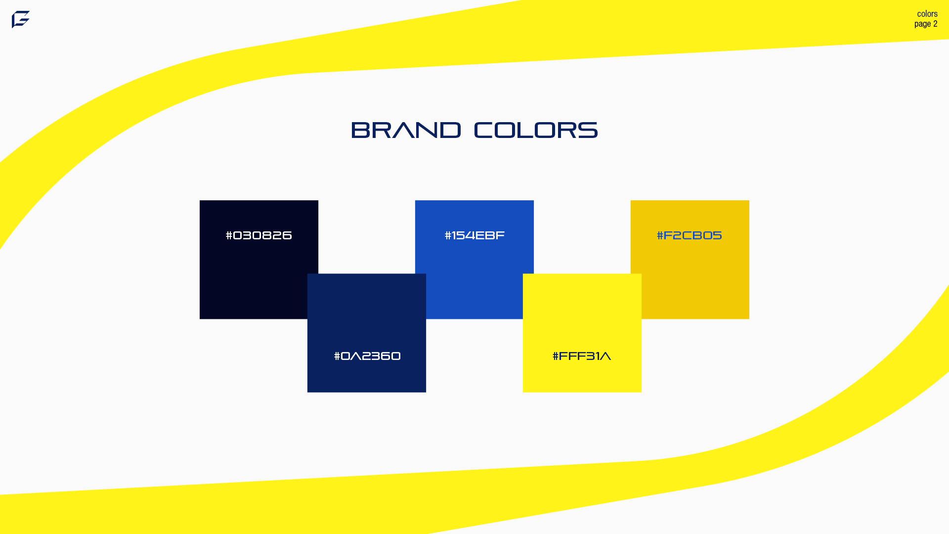
COLOR PALETTE:
A wide color palette is very important for a brand's recognizability and consistency. When there's no question on who the colors belong to, there's no question of the brand. This palette can be used for a wide variety of aspects that relate to the brand.
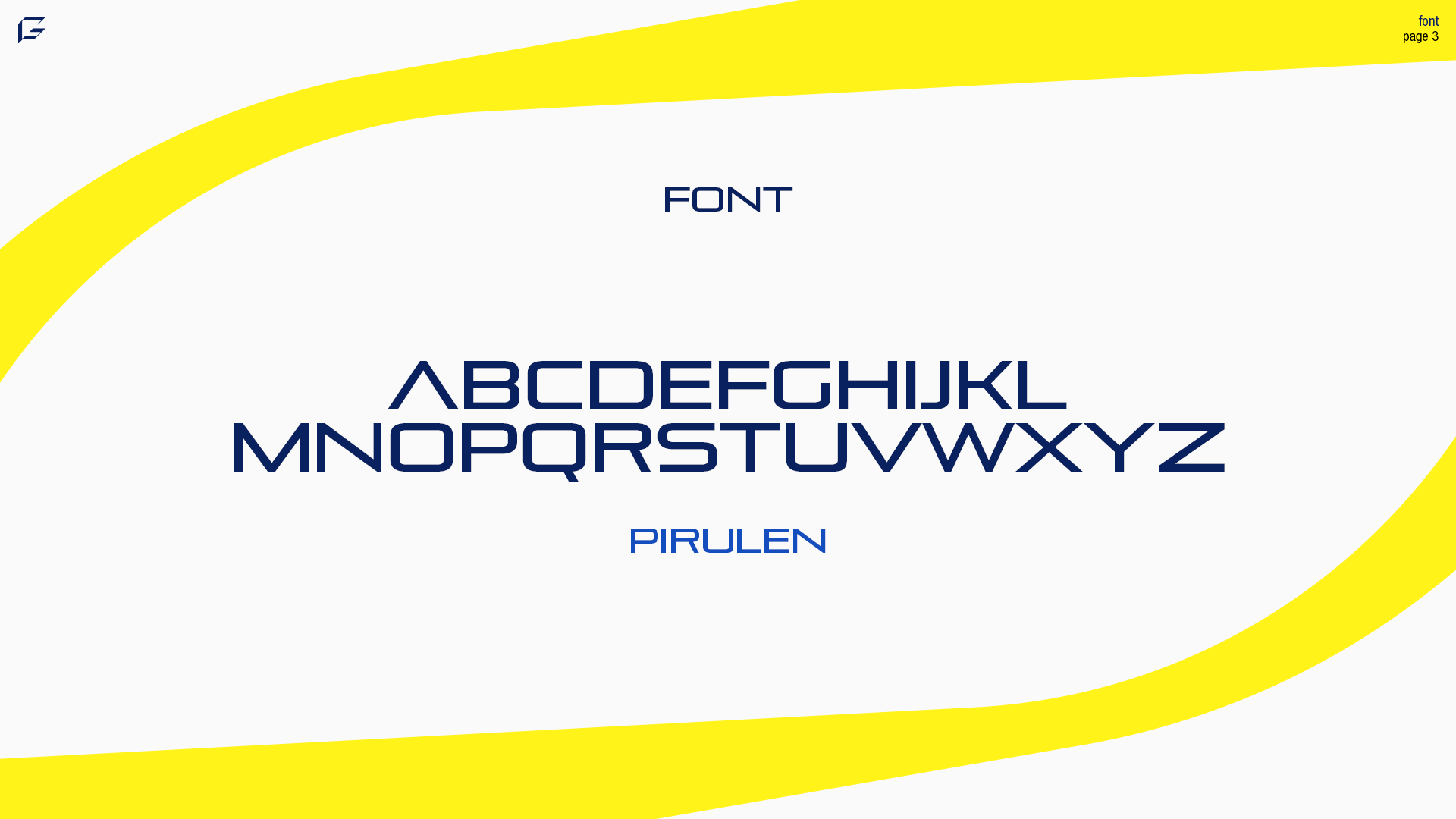
FONT CHOICE:
Pirulen was the perfect font to use to make up this logo mark. I don't think there's a bold version, so in the logo I added a stroke on the text to make it thicker to stand out.
Compared to the previously used font Pirulen is nice and sharp, which gives the energy of technology.
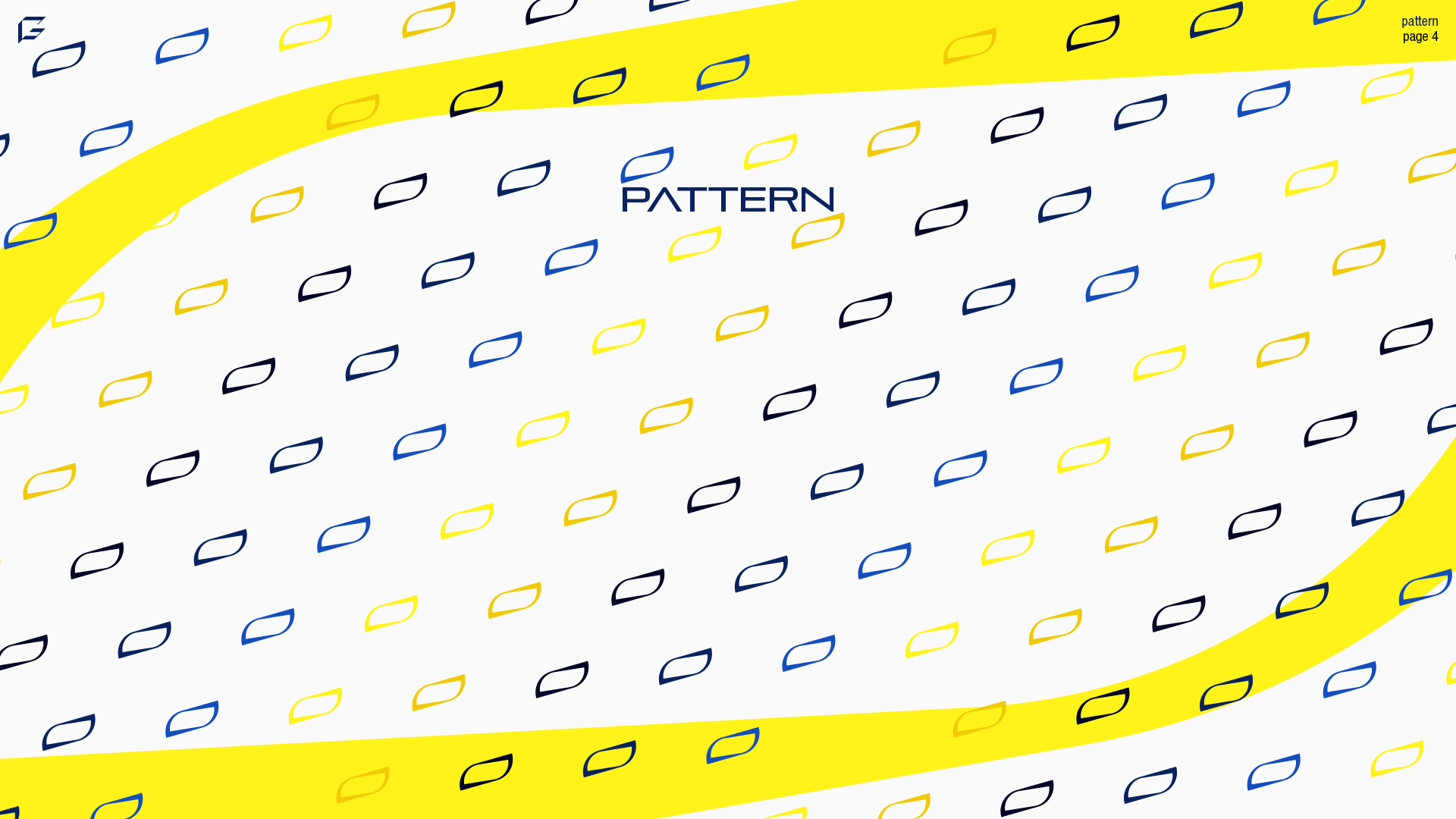
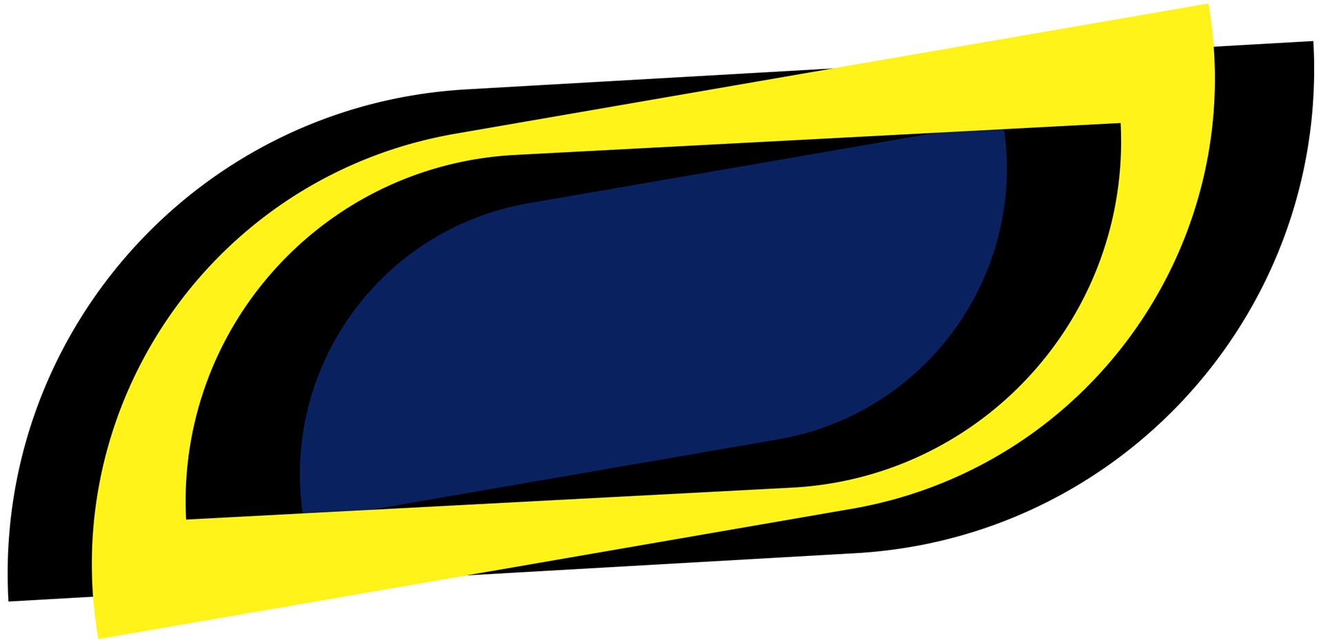
BRAND PATTERN:
A simple repeating logo pattern can make a world of difference in the customer experience. This icon is the one from the background of the PC Quest logo and the background of all the slides. Since this company makes and sells computers/computer parts, I could definitely see them using some sort of packing paper with this pattern on it.
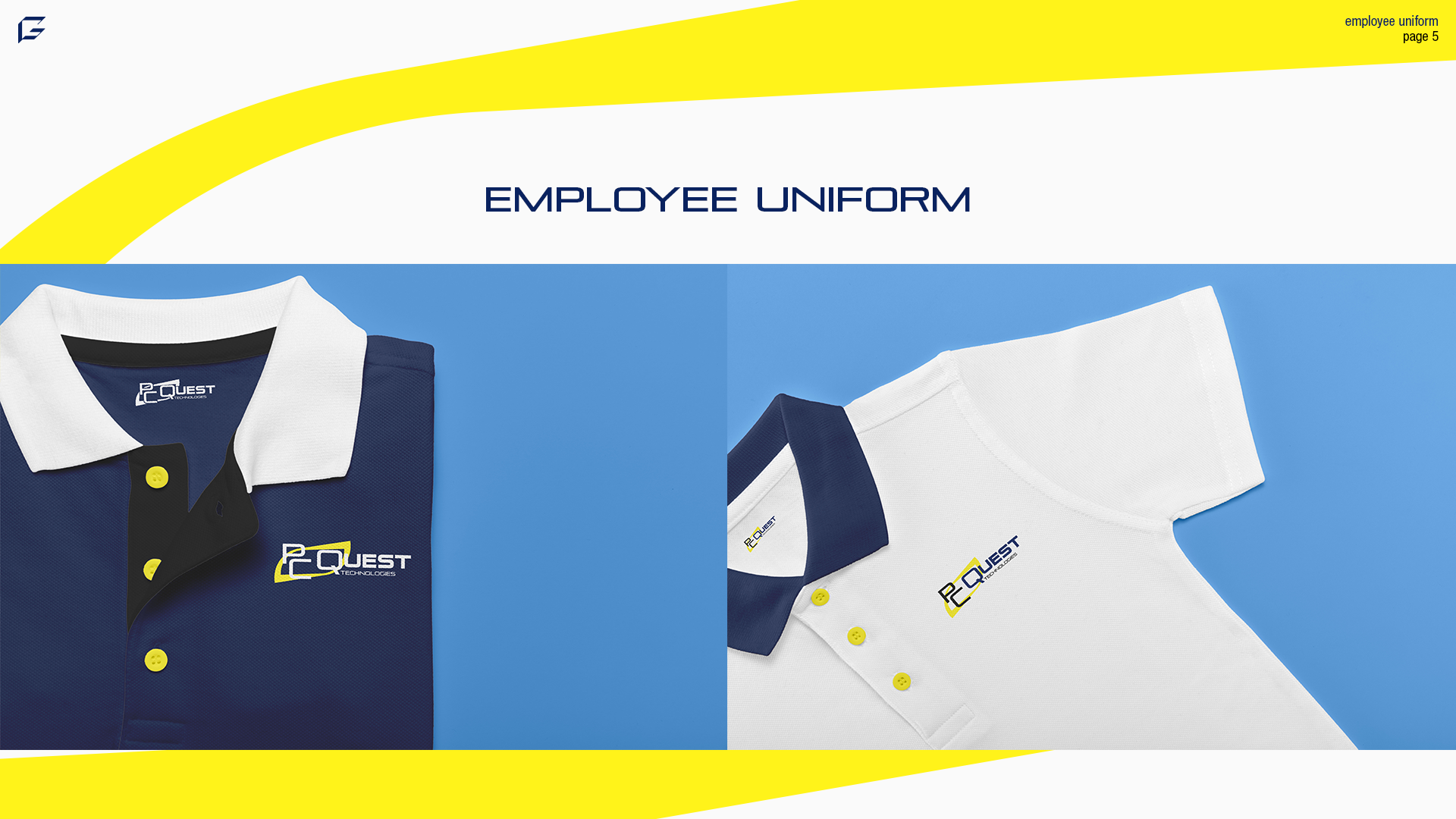
EMPLOYEE UNIFORM:
Employee uniforms are extremely important for companies in order for employees to feel like they're a part of the same team. Representing the same team bring employees together.
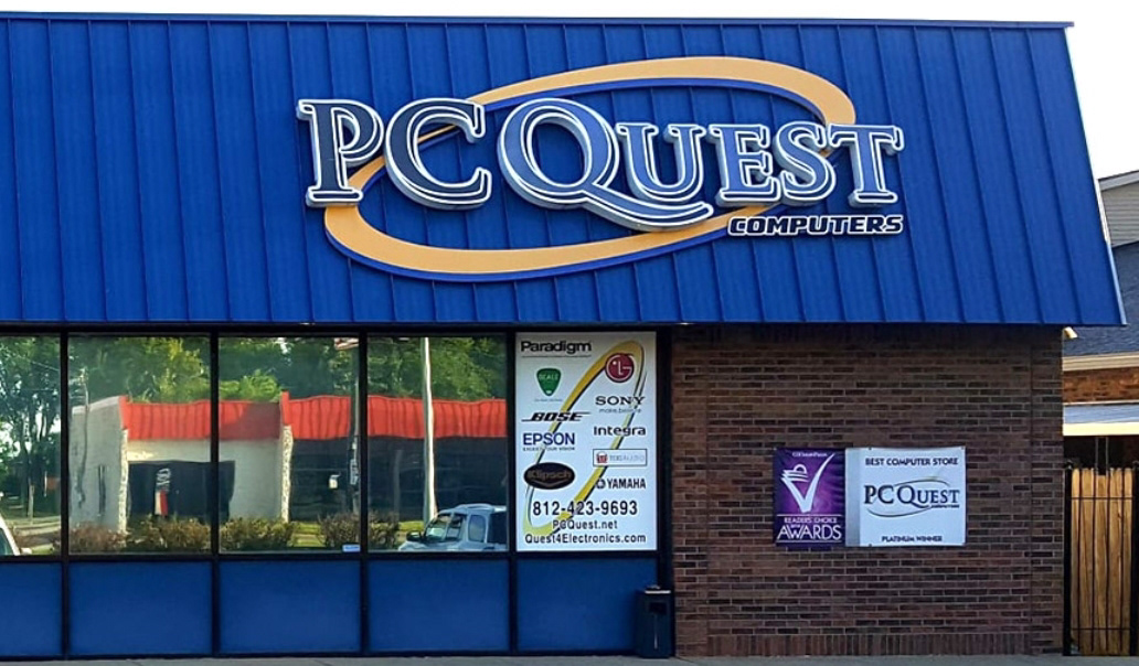
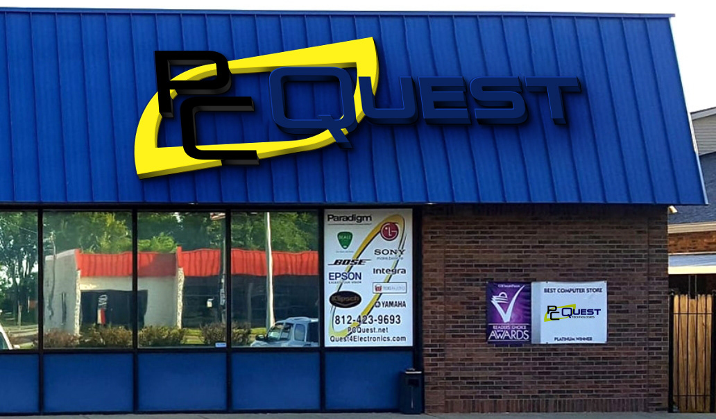
SIGNAGE:
Logos must be adaptable in any environment. The updated signage is no different. As you can see, this is a photo of the front of the building with the before and after of the new logo.
The new logo does a much better job at communicating technology.
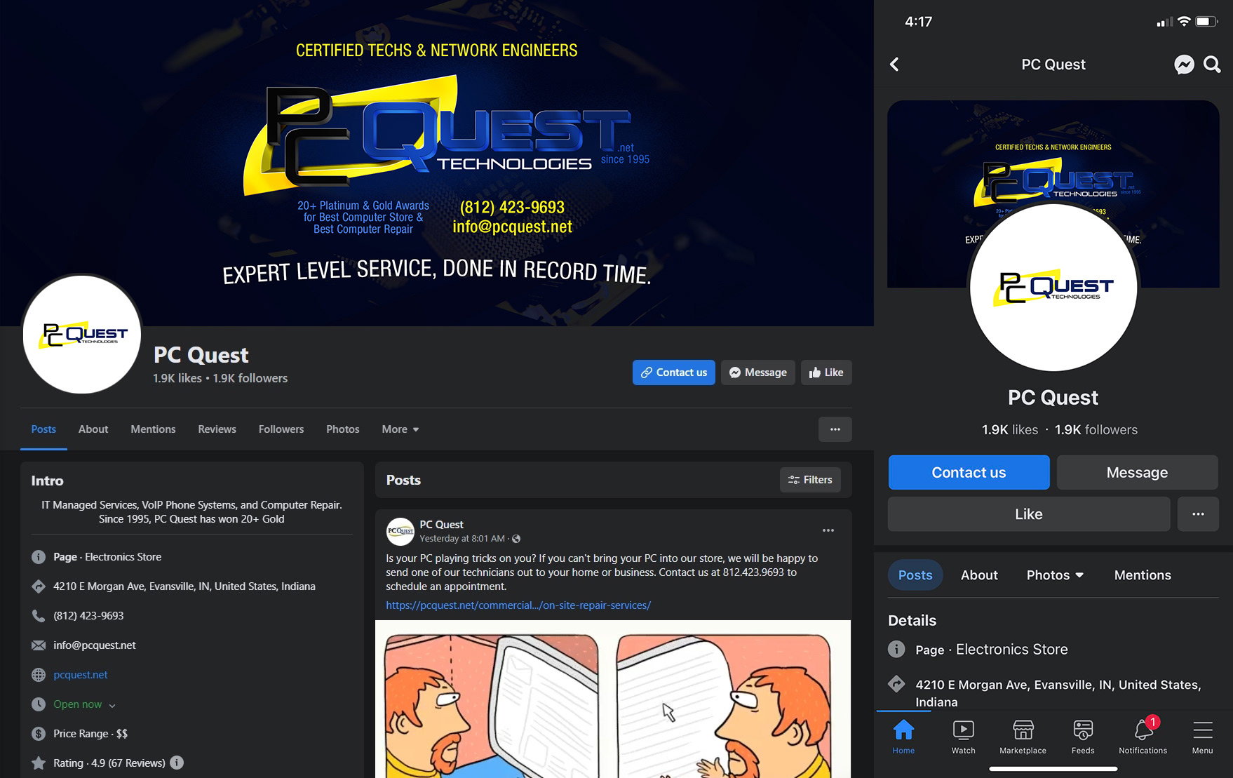
SOCIAL MEDIAS:
Social media has become an evolving foundational element to a brand's success. Part of that success is drawn from the first impression that branding leaves on a potential customer. In the case of PC Quest, this updated logo design fits in nicely on social media.
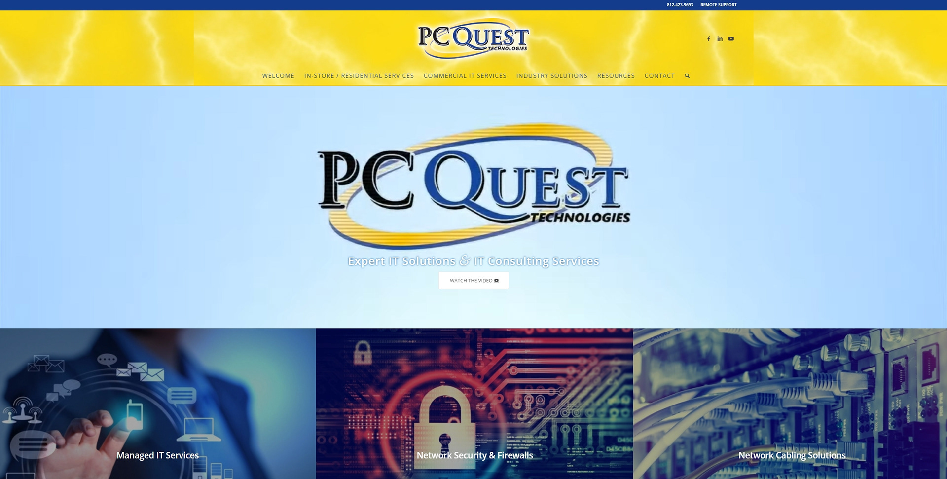
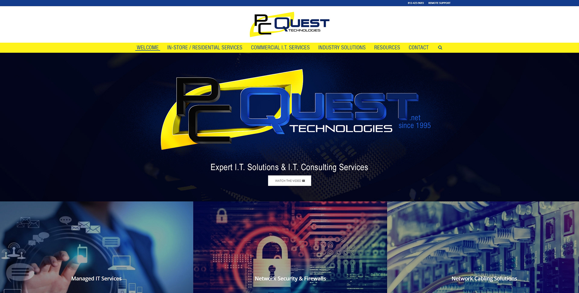
WEBSITE:
Right along with the social medias, a company's website is essential for a brand to have. Not only a website, but an up-to-date website that is clear and inviting. With the new PC Quest logo, PC Quest has the opportunity to look sleek and respectable to potential customers that land on their page.


“Any sufficiently advanced technology is indistinguishable from magic.”
-Arthur C. Clarke
-Arthur C. Clarke